
We were each tasked with bringing our own stylistic twists and turns to the spaces, with table top choices, art, and accessories. We couldn’t make any structural changes (basically, anything already built-in had to stay that way), so it all depended on what we had borrowed, bought, trucked in, hung up, propped, arranged, set or leaned to tell a compelling, if not somewhat fantasy-based story, helping visitors see the kitchens in a whole new light. Basically a styling assignment, but not unlike working within the confines of bringing a room to life in a rental, or working with a client itching for change yet not yet ready, willing or able to renovate.

The other major given, too, was the table setting: event co-sponsor Prouna, a purveyor of luxury stemware, flatware, and fine bone china, much of it encrusted with a glittering scatter of Swarovski crystals (yes, you can eat off them... just hand-wash, please!). Several patterns seemed perfectly matched to this kitchen of icy, silvery and pewter tones, some even cut of the same fine cloth as the kitchen’s pre-existing chandelier, an exuberant orb of crystalline flowers (Prouna’s Platinum Leaves pattern, an early front runner, seemed made for this kitchen, and that light.)
All great news, right? Well, yes and yes-ish. These, as they say, are all good problems to have.
The kitchen I was given was by far the most traditional within the sleek Bilotta space, and that’s not necessarily where I would start, even though I really haven’t met a style I didn’t like (and I’ve done my own traditional kitchens before without issue, with a few more in the pipeline). The amazing array of Prouna’s pieces and patterns from which to choose is also far more fanciful than I might consider left to my own more modern and minimal devices. But I also love a challenge, the attraction of opposites, and the game of “compare and contrast,” so I knew, right away, these traditional (and, with elegant curves and a floral chandelier) somewhat feminine beautiful bones would be getting some modern, masculine elements to create the good kind of tension from which any room, fictional or family-friendly, benefits.
 |
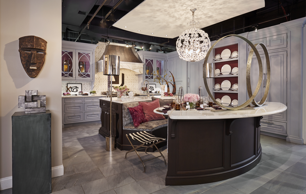
| Starting point: The original Bilotta kitchen |
Color Story, Part 1...
and the “Divide by Two” Rule
The first task to tackle was making my mark on the space
itself, and for that, I turned to my favorite tool in the toolbox: color. I
knew this blue-ish gray, white and brown kitchen would play well with almost
any kind of palette. But when I’m working with givens, I like to knit in rather
than purely layer on. So I came up with a plan that’s proven to make sense even
outside this kitchen: when faced with an existing color to add, work with or
around, see what happens when you break the main existing color into its two
biggest parts... so in this case, the predominately gray background was broken
into its two parts: black and white (a purple room could be split into red and
blue, as one example, a beige room broken into deep brown and pure white, another).
When both black and white are used intentionally, I think the
effect can be strong, graphic and gutsy. I also knew bringing more white into
the kitchen would make the marble countertops and white tabletop seem like intentional
choices of my own, not just a bit of lucky and rich inheritance. (I’m a fan of what
I like to call “intentional white.” See how here and here, and stay
tuned for more!)
With black and white as my first decision, the next one was exactly how to bring it. I decided to take the “art” part of the “Art of the Table” assignment very seriously, and start where I often do, especially when no client is on board: with art. Off to see Christine Berry of Berry Campbell gallery I went, and she graciously let me raid the ample and inspiring storehouses of their recently and gorgeously expanded Chelsea gallery.
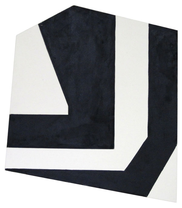
Immediately, Ken Greenleaf’s shaped canvases (non-rectilinear art a current and ongoing obsession, sure to pick up more fans when the Frank Stella show comes to town later this year) and Ken’s small-but-super-strong charcoal drawings felt like they’d provide great contrast to the finer lines and sweeping arcs of the surrounding cabinetry.
Done, and done, and the gracious Christine didn’t bat an eye when I revealed I’d be hanging the main canvas above the stove, arguably the kitchen’s focal point, although not the most traditional of places to hang a museum quality piece! Ah, the fun of a fantasy installation, but in all seriousness, not every gorgeous Manhattan kitchen always gets cooked in, so not that far in the realm of folly.

To add to the art story, metal sculptures (another current obsession), deceivingly high-end in appearance, but in reality, from the go-to treasure troves of Arteriors Home.
Suddenly, a narrative framework emerged, one of an art-driven modernist who’d inherited a classic kitchen (maybe in a great Brooklyn brownstone), and other decisions started to fall into place.

While the framework was coming into focus, I started to narrow down the china choices. While the Hemisphere pattern caught my eye early, I also kept coming back to the Pavo Silver, and what turned out, at first, to be the sticking points for that choice— an overall, nearly-Baroque, no-holds-barred pattern and its purplish, lavender wash, both of which seemed distinctively NOT very “modernist” or (and please pardon the gender assumptions) masculine— ended up being wonderful palette inspiration. Hey, even a minimalist is allowed to get his bling on and set a fancy table every now and then, and we’re entering the season of bounty where fancy tables anchor family gathering and professional fetes... so why not let my fictional modernist in on the fun? Plus, “fancy” is what Prouna does best.
 That lavender wash (and a deeper,
richer purple rim on the bread and butter and salad plates) made me realize
that the range of purples, from aubergine to amethyst, lavender to mauve, would
be a perfect yet unexpected color choice... what could be more modern than
that?
That lavender wash (and a deeper,
richer purple rim on the bread and butter and salad plates) made me realize
that the range of purples, from aubergine to amethyst, lavender to mauve, would
be a perfect yet unexpected color choice... what could be more modern than
that?  |
| The heroically scaled Fiercely Remote, by Perle Fine, courtesy Berry Campbell, was tucked into the Butler's pantry, and provided more color reinforcement, knitting together the room's range of purples. |
 Amplifying What’s
There
Amplifying What’s
There I do also very much like “bouncing the bones” of a room further into it. Otherwise, you end with two pieces, and a split-personality, two awkward party guests with nothing in common to discuss. I still had two components that needed bouncing to knit content and shell: those purples from the tabletop, and the deep espresso base to the kitchen island, table and the closing curve of the cozy banquette.

To get the room’s brown further integrated into the add-on layer, I turned to accessories, layering on great African pieces (that echoed the Greenleaf angles) courtesy Bruce Tilley’s Décor NYC, and tortoiseshell, from my own collection and from Pottery Barn, votives used as water glasses, and hurricanes used in the cabinets.

I’m a self-professed sucker for fall. So once pheasants appeared on the Pavo plates, I helplessly fell for fall: this would be a decidedly autumn table. But can you create autumn in an ice-toned room more suited for a Doctor Zhivago, totally-Frozen fantasy? I say yes! Like bringing the cozy autumn aesthetic to a modern space, there are ways to bring a seasonal vibe with nary a pumpkin or pilgrim in sight.


Stay Open to
Inspiration
Even a strict and solid design plan benefits from an open
eye. In the midst of planning, with most pieces in play, some yet-to-be
determined, I clicked on an email from Daniel Cooney Fine Art, heralding one of their frequent online iGavel auctions.
The image that greeted me stopped me in my tracks and quickened my pulse: Greg Endries’ “Dimitry,” an edgy (I
don’t always love that word, but sometimes it truly fits!) image stared back at
me from my email. The mix of the earthy background, the surprising elegance and modern-baroque of the all-over tattoo, the chic tone-on-tone Louis Vuitton scarf and black leather jacket... even the touch of purple at the lips and coppery-brown sweep of hair... spoke to everything I was hoping this room would be, both color- and vibe-wise. That all-over pattern of his facial tattoo also found a surprising counterpoint to the pattern of the china, a modern Baroque motif that created the room’s “New Kind of Elegant” title.

It proves that ANY interior scheme is an organic process,
subject to midstream twists and turns, and this late arrival crystallized all other choices.

Tricking the
Traditional
Along the way, I also leaned on some other tricks to take
any possible fussiness out of a traditional scheme, while still being inspired
by it: an organic layer, a mix of high and low, shape and scale, and repeated
geometry.
 What holds its own against the finely crafted man-made? Organic elements— rock
crystal, horn, petrified wood, the stunning feathered pillows courtesy Dransfield & Ross, even the styling
choices of eggplants and chestnuts— all related to pieces already in the room,
and provided their own strong punctuation (My favorite detail: rock crystal
pieces from Jayson Home used as knife rests!) Pottery Barn glassware and pillows mixed high and low at the
table. All these choices keep any potential pretentiousness at bay, like balancing the sweetness of a dish with a more acidic wine
selection.
What holds its own against the finely crafted man-made? Organic elements— rock
crystal, horn, petrified wood, the stunning feathered pillows courtesy Dransfield & Ross, even the styling
choices of eggplants and chestnuts— all related to pieces already in the room,
and provided their own strong punctuation (My favorite detail: rock crystal
pieces from Jayson Home used as knife rests!) Pottery Barn glassware and pillows mixed high and low at the
table. All these choices keep any potential pretentiousness at bay, like balancing the sweetness of a dish with a more acidic wine
selection.
 What holds its own against the finely crafted man-made? Organic elements— rock
crystal, horn, petrified wood, the stunning feathered pillows courtesy Dransfield & Ross, even the styling
choices of eggplants and chestnuts— all related to pieces already in the room,
and provided their own strong punctuation (My favorite detail: rock crystal
pieces from Jayson Home used as knife rests!) Pottery Barn glassware and pillows mixed high and low at the
table. All these choices keep any potential pretentiousness at bay, like balancing the sweetness of a dish with a more acidic wine
selection.
What holds its own against the finely crafted man-made? Organic elements— rock
crystal, horn, petrified wood, the stunning feathered pillows courtesy Dransfield & Ross, even the styling
choices of eggplants and chestnuts— all related to pieces already in the room,
and provided their own strong punctuation (My favorite detail: rock crystal
pieces from Jayson Home used as knife rests!) Pottery Barn glassware and pillows mixed high and low at the
table. All these choices keep any potential pretentiousness at bay, like balancing the sweetness of a dish with a more acidic wine
selection. The ornate quilting of the Pottery Barn Caitilin pillows also mimicked the overhead light fixture and Platinum Leaves plates used on the plate display shelves.

John Lyle’s Shannon floor lamps stood like sentinels while bringing architectural presence with their strong, graphic shapes. An underpinning of repeated and simplified geometry also amplified built-in details (the Greenleaf pieces a bridge to the earthy zebra-hide stool). Around the room’s edges, china choices became more graphic and simplified, Prouna’s Origin line, creating graphic moments while keeping the focus on the table.

Another trick to keeping a traditional tabletop or styling scheme fresh and unfussy: simplified floral arrangements that let single blooms really shine, keeping the emphasis on color and shape. Talented friend Matthew Kusniar picked materials to be perfect counterpoint or partner to colors and shapes and materials in the room, bringing feathery lavender mums to the table, their dome of color having a happy conversation with both the overhead fixture and the placemats. On the built-in sideboard, white and purple calla lilies mimicked the horns that also appeared frequently throughout the space.


It also proves that it's all about the mix: modern and traditional, urban and organic, masculine and feminine, and the mix is where the energy comes from: like a great brownstone filled with contemporary art and mid-century furnishings, each is all the better for the contrast. You end up noticing the traditional elements (in this case, a great zinc and marble hood, overlapping circular moldings of the glass-front cabinets and plate display niches) more with a modern layer than you might with an all-out traditional scheme.
Thanks to all the amazing partners for making my Art of the
Table appearance possible!
Kitchen Design: Bilotta
Dinnerware, Serveware, Flatware, Stemware: Prouna
Media partner, Art of the Table: Traditional Home
Backsplash Tile: Artistic Tile
Wallcovering: Thibaut
Paintings and works on paper: Berry Campbell
Standing Polished Bronze Lamps: John Lyle Design
Floral Design: Matthew Kusniar, NYC
Metal Sculptures: Arteriors Home
Floral Design: Matthew Kusniar, NYC
Metal Sculptures: Arteriors Home
African Masks: Decor NYC
Feathered Pillows: Dransfield & Ross
Candles: Fivestripes
Candelabra: SwitchModern.com
Placemats: Jayson Home
Beaded Napkin Rings: Dransfield & Ross
Candelabra: SwitchModern.com
Placemats: Jayson Home
Beaded Napkin Rings: Dransfield & Ross
Agate Coasters: Jayson Home
Horn Decorative Items: Arteriors Home
Horn Decorative Items: Arteriors Home
Petrified Wood Bowl, Horn Serving Items, Crystals, Serving Trays: Jayson Home
Tortoise Accessories and Velvet Pillow Covers: Pottery Barn
Napkins: Crate & Barrel
Napkins: Crate & Barrel
Metal Obelisks: Williams-Sonoma Home
Installation and tabletop shots: Jody Kivort
Get the look! See items included in, and inspired by my "New Kind of Elegant" kitchen and "Autumn Aubergine" tabletop on Pinterest.


This comment has been removed by a blog administrator.
ReplyDelete