Monday, February 11, 2013

...about starting with art: Catharine Grasty

I'm lucky to be part of an extremely creative group of friends and colleagues on Facebook. Whether by artists, antiques dealers, or fellow interior designers, my News Feed is regularly populated with delicious images of artwork of various origin, famous and not-so. And more than once, I've responded: "I could build a whole room around that image." So, I finally decided to.

When Vancouver-based interior designer and visual artist Catharine Grasty posted an image of her own acrylic on board painting "Intrinsic Balance," I loved its proportion, its format, and its combination of strength and grace. I knew it could be the amazing starting point to a room. And that two-part push-pull inspired a room that's both modern and not, angular and curved, strong and soft, boldy graphic and subtly textured.

The room I envision is a Master Bedroom, where Catharine's painting hangs opposite a bed. (Too often, people put the best art in the room over the bed. But I like to hang art where you can see it, dozing off or waking up, opposite the bed.) I see the painting above Wisteria's Glass Desk (as a work surface, or even a vanity). I've been in love with that desk ever since Wisteria first premiered it (and what a GREAT pricepoint!) and fell in love with it all over again when Kevin Dumais used it in his mini-marvel of a studio model apartment, which I toured for Apartment Therapy. I'd see it paired with the armchair version of Jayson Home's Bonaparte Chair. On the desk (or dresser), one or a pair of my very new favorite lamp, the aptly-named Ultrachic table lamp from Currey & Company
This fantasy room was largely inspired by a room that's stuck with me for years: Noel Jeffrey's Hollywood-chic, Carol-Lombard-channeling bedroom at the 2010 Kips Bay Designer Showhouse.

Beside the bed, holding the weight of the painting on the opposite wall in what I see as a mostly-white room, a pair of Horchow's Chayne Bombé Chests as bedside tables. To bring the modern vibe of the painting and angular glass desk bedside, I'd consider a pair of Aretmide's ever-classic Tizio lamps, in white or silver (yup, you can mix metals) as the bedside lamps, perfect for bringing the light right where you need it for nighttime reading. 

I'd love to see the bold stripe of Duralee's wide Oxford Stripe in Canary used to cover Wisteria's upholstered headboard, whose whitewashed taupe wood brings the painting's two warm and cool lighter fields together. Underfoot, wall-to-wall carpeting: Stark's all-over geometric, Astinn (if there's one room in the house where I LOVE wall-to-wall, it's a bedroom). 

At the windows, relaxed Roman shades of that same stripe, or its smaller-scaled companion. I love when a headboard has the strongest connection to the room's window treatments.
I'd keep the Hollywood glam going with Horchow's Clairmonte mirrored dresser. The clean application of mirror finds a playmate with the angular glass desk and the silver Tizios if you went that route.
An alternative to the headboard, a tufted bed... Charles P. Roger's white leather Tansy bed. WIth that white bed and the black Bombé chests, the yellow of the Roman shades could make an appearance in a pair of Jan Shower's Miles lamps

If you love those lamps, but the tufted bed is too much for you, then I'd cover Oly's Helena bed with Schumacher's brand new Vanderbilt Velvet (in Noir), part of their new collection designed by Million Dollar dame Mary McDonald. If you stuck with the wide canary stripes on the headboard, I'd have Solomonic Couture run up a bolster or two from this graphic-new-classic cut velvet, tricked up with Duralee's almost-edible Lemon Ice glass bead trim. 

And since I'm imagining, I'd imagine this room is big enough for that bed and desk, and also a sitting area (Hey, it's my dream). Anchoring that sitting area, and mimicking the sweep, curve and negative space of the painting, the Florence Settee from John Boone (here, in white, but shown in bright yellow in the January/February issue of ELLE Décor).

Chair-wise, a cozy pair of high-back but low-slung (there's that push-pull again...) Windmere tufted chairs from Horchow, paired with Jan Showers' Cote D'Azur coffee table (with another Bonaparte armchair as a pull-up companion). I'd love these chairs, especially paired with that tufted bed, or maybe even zazzed up (hey, I'm making up the room... I can make up a word) with a truer canary silk. Above the grouping or dresser, Horchow's white Porcupine Quill mirror

As an alternative to the Cote D'Azur, a pair of Mitchell Gold + Bob Williams' new Claro tables, or Jan Showers' geometric Anders table. WIth that table, I'd go a white silk velvet on the tufted chairs.

Since I can never get enough zebra, and I also love the look of layering throw rugs over wall-to-wall, I'd use Design Within Reach's Edelman Leather's zebra-printed cowhide to anchor both the desk (or vanity) and sitting areas. 

That was FUN. I think I might just make that a regular feature! How has art inspired you?

Get social! Follow Schumacher on Facebook and Twitter, follow Jan Showers on Facebook and Twitter, follow Design WIthin Reach, DuraleeMitchell Gold + Bob Williams, and Horchow on Facebook, and follow me on Pinterest and Twitter.

Saturday, February 2, 2013

...about Matthew Patrick Smyth: Hearst Designer Visions: Alchemy, Origami and Other Acts of Design Magic

In the show-off world of show houses, it’s often those who whisper that have the most interesting things to say. And the most from which to learn. Walking into a room designed by Matthew Patrick Smyth is like walking into a How To guide. How to mix patterns. How to add the grace of age to new construction. When to camouflage, when to celebrate. And walking into his latest venture, a full apartment at 250 West Street, part of Hearst’s Designer Visions, there’s a lot of learning to be had at the hand of Mr. Smyth.

Representing ELLE Décor (at the behest of the wise editor Michael Boodro), and tackling a 1,880 square-foot unit in the industrial-to-residential conversion in TriBeCa, Matthew brings his signature sense of quiet chic to this unit that features two bedrooms, a walk-in closet big enough to host guests in, and that baffling floorplan line item, the “Auxiliary Room,” which turns out to be his, and the whole project’s, grace note.

While you might not be able to dole out the deposit to make this unit your own (and this one’s already sold, anyhow), there are plenty of things you can learn from Matthew, one of the industry’s most gracious and talented of tutors.

A Quiet Riot of Pattern
The activity from this largely quiet design scheme comes from patterns, and Matthew is as adapt at mixing patterns as the mixologists at Death + Company, with results just as intoxicating. A Schumacher Ikat (Tali Weave, in Dove), paisleys, stripes, herringbones, and grids enliven without overwhelming, and the mix looks evolved, not trucked in all in one day (even if, um, it probably was).


A herringbone wallcovering (one of two from Hermés in the study) grounds the room’s breezy palm paper (the other). A hand-painted paper from The Alpha Workshops with the look of Venetian plaster in the bedroom is a subtle but painterly checkerboard that plays well with that room’s structured paisley bedding and patterned carpet.


Even his textures are patterns, like the carved front of the living room’s cabinet, the ottoman's tufting and underfoot, carpets with highly textural weaves of otherwise neutral grounds.

Why is the net result quiet, not riot?

His ability to mix scale of pattern, and the limited palette are big reasons. Matthew only slightly turns the dial up and down on his edited color wheel, and flips the script from room to room with items of higher contrast. In the living room, for example, walls are dark and everything else not, while the office is an airier daytime take on exactly the same colors.

He also knows when to call it quits. Solid and nearly solid fabrics provide pattern breathers on upholstery throughout.


Push or Pull the Givens
Show houses and model apartments oftentimes come with givens, and in commercial conversions, in new construction, even at the high end, that means rooms without windows, odd columns, and builder basic baths and kitchens. While the “basic” bathrooms in this project are anything but (yards and yards and YARDS of creamy striped marble, in a color that’s the froth of a milky cappuccino) the unit Matthew inherited had some of those other pitfalls.

Matthew counters the thunk of the huge living room column by stealing its considerable thunder, painting it the same color as the walls, then balancing all the room’s furniture away from it, and using its front-and-center position to divide the open plan’s main living space into two seating groupings. 

Granted, that column and the giant (GIANT!) kitchen island create an odd eddy of space where neither circulation nor island seating is ideal, but the most lemondrop martinis are made from this lemon as is possible. It’s a huge column, and the “paint it away” trick really works. Elephant? What elephant?

An industrial base, and custom painted burlap top from The Alpha Workshops form the partner's desk in the study.

As much as Matthew pushes past that obstacle, he pulls from other givens to create a cohesive space that seems like every inch, even the standard-issue bathrooms, were deliberate design choices. The creamy palette of the entire space (largely, gray and tan) pours from the master bath’s figured stone.

By noting and celebrating that built-in, Matthew not only creates a calm cohesion that works brilliantly (especially in a model apartment), the master bath becomes an even bigger star, and the incoming owner is spared that odd new-purchase phenomenon of gutting a brand new bathroom. This one will do just fine, since it’s certainly, suddenly, no compromise or afterthought.

Photo: Bjorn Wallander for ELLE Decor
Keep Calm and Repeat, Repeat, Repeat
While space is not the issue here, Matthew employs the best of space-saving tricks: limit your design elements, and repeat them often. Along with that limited palette, Matthew has repeated wood finishes (painted, and the finish of the moment, driftwood, in the kitchen’s Poggenpohl cabinets and the bedroom’s dresser from Oly) and lamps throughout share transparent bases.

The other trend at play is the studied and intentional use of white, like the living room’s large mirror and the plaster-finish one, also by Oly, in the dining room. They seem natural extensions of the lightest veining in that bathroom marble, and the ground of that muted, marbly Schumacher upholstery covering the banquette.

Paint plays a big part of that designed repetition: all ceilings save one are painted the same color, and trim remains the same from room to room as well. Matthew’s paint picks? From the Color Stories line from Benjamin Moore. The living room’s paint color finds a close consort with the large-scale subway tiles from Ann Sacks, and the industrial gray gets a literal treatment, in the study’s partner desk. Those industrial notes honor the building’s, and neighborhood's, grittier days, too.


Dining Room
I often hear designer friends talk of rooms that have stayed with them, in their memory and inspiration bank and clipping files, over time, in spite of trend and fad. Matthew’s dining room deserves to be remembered in that same realm.


It’s the layout’s “Auxiliary Room,” sometimes up-sold by an eager realtor as the “bonus” room. But this bonus was no winner to start with. Near the front of the apartment, far from the windows and without any of its own, the room had all the potential to be the apartment’s throwaway space. 


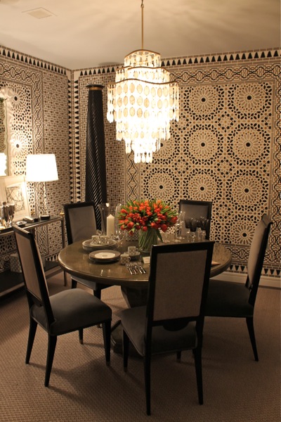
Matthew would have none of that, and part Cinderalla, part Aladdin, the room made a magical and exotic transformation. Matthew (and the world’s most fastidious paperhanger, no doubt) made that magic with an all-over application of Schumacher’s Nasrid Palace Mosaic (here, in Mica, another repeat of gray, tan, black and white). The result is a room that charms, seduces, and transports. Suddenly, who cares if there’s no window, when crystal sparkles, candles flicker, and glasses clink? Genius.
Schumacher's Nasrid Palace Mosaic, Mica 

Art can match
I have always cringed at the sneered expression by those seemingly in the know: “Your art shouldn’t match your sofa.” While I get (and agree with, in part) the gist of that, I’ve never been opposed to using art to inform the rest of a space’s color choices... and having art in one room repeat color and feel. The weathered painted piece in the living room from a Hudson gallery captures the apartment’s palette, like a storehouse of color, spun off elsewhere in larger doses. And there’s nothing wrong with that.
Adding Architecture
The biggest lack in most current residential architecture is, well, the architecture part. Big boxes, exposed this-and-that (“Loft living!” all the brochures proclaim) have little or no saving grace. So how do you add interest without faking it with carted-in and tacked up baseboards and crown moldings?
Matthew use grids, scale, wallpaper and even architectural remnants as the suitable stand-ins (in ways that could, portably, also nicely impact a rental). A huge grid of a custom photo blow-up creates an almost-window in the living room, and the kitchen tile, run to the ceiling, repeats the grid. 


The stunning frame for the bed is a throw-back to ages past but still stays thoroughly modern (it was the first piece Matthew chose for the room) through its sculptural, object-like handling, as do the ebonized columns in the dining room and the capital table base in the dressing room/walk-in closet. 
And the wallpapers make this new construction settle down and in, Schumacher mosaic, Alpha grid, Hermés palms.

Telling a Story... of Changing Times
Like in any model apartment project, there is no client and the designer is left, for better or for worse, to start from scratch, save the demographics of the target buyer shared in a planning meeting and through some safe assumptions about floorplan and neighborhood. The two-bedroom plan (plus that “Auxiliary room”), along with the trendy west side waterfront location steered this ship toward a young(ish) couple.

Photo courtesy Quintessence, with permission
But as Matthew told ELLE Décor, “Partway through the project I realized that it didn’t matter if it was a straight couple or gay couple, so I turned the imaginary owners into two men.” He even conjured up that couple by way of Google... he searched for “two men on vaction,” and voila, the Mr. and Mr. of the House had faces, smiling back from bedroom picture frames. 

We’ve come a long and lovely way from the days when the editors on the mastheads of the most sophisticated shelter mags got hate mail when they dared publish the dwelling of any same-sex couple. Now, it can be the source of beautiful inspiration. 

Like those men in those pictures Matthew cut and pasted off the Internet and into picture frames, and like most of Matthew’s work, the word “handsome” squarely applies.  I could get used to this kind of teaching. Class dismissed!

Hearst Designer Visions will be open to the public Saturday, February 16th, 2013, with all proceeds to benefit DIFFA: Design Industries Foundation Fighting AIDS.