Clichéd or not, like it or not, it’s an inarguable fact: the
design world has long been populated by a considerable presence of gay, lesbian,
bisexual, and transgender women and men, LGBT people who own and run and patronize its
galleries and showrooms, edit and publish and appear in its magazines, receive
its honors and awards, exuberantly contribute to popular trend and global culture.... and spend— and facilitate the spending of— billions of dollars.
Let's head down to New York's Greenwich Village, historic turf in the LGBT story, to see why Part 3 of my Design Best of 2016 honors design developments
from, within, and impacting the LGBT community: a community I’m proud to be a
part of, even if the year for us was marred by great tragedy... and has been before. Because so much of that pride stems from how we remember, and how we react, and how we rise, in those terrible times.
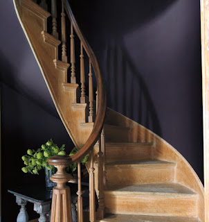
A redesigned wedge of the West Village was dedicated this past World AIDS Day in Manhattan, to honor the New York community catastrophically decimated by the AIDS epidemic. It sits in the shadow of the now-shuttered St. Vincent’s, the hospital which saw so many enter its halls with a then-mystery ailment... and never walk back out, bodies instead taken out subterranean hallways, to funeral homes who often refused them even in death, out of fear, religious zealotry, or sheer ignorance.
That was part of the bleak reality of the New York City chapter of the AIDS crisis, but the city park and monument are anything but. Somber, in some ways, but dwelling in a place of strength, honor, and inspiration, not solely mourning.
The shape of its plot, and the triangles of and within its canopy give meaningful structure to a triangle of another
color: the Pink Triangle of Nazi Germany, stitched to shirt and jacket arms of
confirmed or suspected Gays during the Holocaust, and the reverberation of
symbolism begins there. The triangle,
also an integral part of the geometry of quilt making, also hearkens to “the
Quilt,” the Names Project that honored and deeply touched so many, for its ability
to communicate both intimate humanity and staggering scale.
The canopy, like the Calatrava Transportation Hub, is most intentionally white, seemingly borrowing from a nearby building to help give the small parcel some greater significance, but also carrying its own baggage of color symbolism: both hospital and heaven come to mind, in its sterility and, in bright Manhhattan light, its dazzle.
The memorial also incorporates a permanent installation by
text-driven visual artist Jenny Holtzer, who selected passages from Walt
Whitman’s “Song of Myself,” radiating from the monument’s center. That ring
ripples outward from the quiet, shaded interior, towards the din and activity of
the surrounding streets. It’s an apt visual metaphor for the loss that began for each victim in
one place, privately, then quickly amplified, and stripped so many of
so much, from our homes, neighborhoods, lives, and American culture, in ways we'll probably never fully understand.
Although diminutive in size by most standards, the memorial
designed by the Brooklyn firm Studio ai
carries great weight. It’s a tricky task, to ask a piece of land, some epoxied steel
and transplanted trees to honor, remember, mourn, lift, and inspire, but the net effect is generally all that, and more. Like
all good public art and memorials,
the final chapter of the experience is written by the visitor, drawing his or her own conclusion,
bringing his or her own memory, grief, or bond, choosing to pause either in the
light or the shadow cast by its angular, sheltering, embracing pergola.
Alexandra Schwartz of the New
Yorker does the site more service than I, and her piece is definitely worth the read. And hear directly from co-founder Christopher Tepper on what’s
next for the memorial, and why its details and choices hold so much
significance, and a possible interactive component, in his interview with POZ.
Grace Under Pressure, and Gays Against Guns:
An Artful Response to Tragedy
The LGBT community is also a population who, in moments of great turmoil, finds
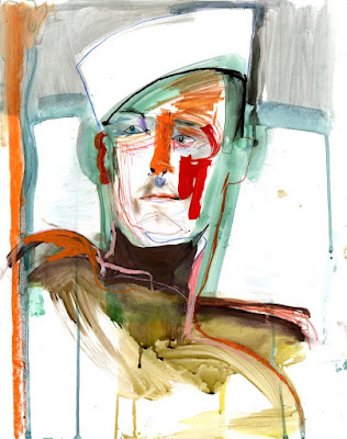
elegant and unique expression as outlet and catalyst to change. This year tested that very theory. In the horrible wake of the massacre at
the Gay nightclub Pulse in Orlando, they did just that. As author J. Bryan Lowder
so movingly documents in “Pulse and the Power of Queer Tears,” his must-read piece for Slate, the healing began with local drag queens exorcising
their grief on Orlando dance floors, with beautiful defiance and ferocity. In
the process, they raised spirits and funds for families of the men and
women who showed up one Saturday night to dance and never made it back home.
The Pulse massacre was not the first time grief has cast its shadow across a community most often defined by exuberance, flamboyance, and pride. Nor is it the first time the response has been art-fueled, choreographed, or designed. It seems the gay community has long understood the advice Meryl Streep gave during her Golden Globe Lifetime achievement award acceptance speech, quoting Carrie Fisher: “Turn heartbeak into art.”
From the AIDS crisis to the ongoing fight for civil rights to GAG's response to unfettered gun violence, the community has done just that, creating great works of art, striking graphic symbolism, prize-winning literature, and pivotal works of cinema and theater.
The beautiful phoenix from grief’s gray ashes: it’s yielded dance-a-thons, art from Keith Haring, plays like Angels in America and Larry Kramer’s The Normal Heart, The Laramie Project, the NoH8 photo series, Io Tillet Wright’s Self Evident Truths portrait project, and more recently, David France’s Academy-Award nominated documentary How to Survive a Plague, and the 2016 companion non-fiction volume of the same name. And our history lessons continue to take artful shape: Alan Bounville's work-in-progress, Adonis Memories, springs to mind, and the personal, compelling videos and stories of I'm From Driftwood, another.
These moments of individual expression have also crystallized larger groups merging activism, fundraising, and the arts: Design Industry Foundation Fights AIDS, Broadway Cares/Equity Fights AIDS (BCEFA) and events like Visual AIDS: Postcards from the Edge, BCEFA’s cheeky “Broadway Bares” fundraisers, and Housing Works’ alignment with the design and fashion communities through Design on a Dime and Fashion for Action.
Of course, it is not only the LGBT community which responds to grief with a desire to create, but it seems to be a stage on which our community of performers, drag queens, designers, singers, songwriters, and authors seems the most at home: to ease mourning, to release grief, to provide catharsis. (My own attempt, an essay for The Bilerico Project on LGBTQ Nation, post-Orlando.)
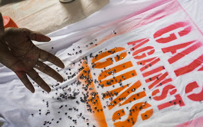
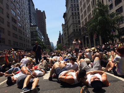
But it didn't stop there. A new national offshoot of this artistic response to grief is Gays Against Guns (GAG), an organization born in the moments of
anger and mourning after the Orlando shooting. GAG is an activism group not unlike other
communities coming together to plead for a stronger solution to our gun
epidemic (The Brady Campaign, Moms Demand Action). But this LGBT group has
infused its grassroots presence with striking visual performance-art-like
presentations: their white-shrouded “Human Beings,” each bearing the image of
one of the Orlando lost, which hushed New York City’s Pride march end to
end at the first of their ghostly appearances, and their anti-NRA “blood
puppets” and die-ins since then. You can even get a DIY GAG t-shirt stencil off of Etsy.
GAG of course owes much of that stylized, theatrical and
considered visual presentation to the earlier ACT UP! (GAG has ACT UP! members within its membership), itself a
reaction to the AIDS crisis, and the creators of verbiage, imagery and language
indelibly linked to the AIDS activism movement... whether cries of "Act up! Fight back! End AIDS!", the Silence = Death symbol, the
St. Patrick’s die-in, or a giant condom covering the home of anti-LGBT North
Carolina Senator Jesse Helms.The Pulse massacre was not the first time grief has cast its shadow across a community most often defined by exuberance, flamboyance, and pride. Nor is it the first time the response has been art-fueled, choreographed, or designed. It seems the gay community has long understood the advice Meryl Streep gave during her Golden Globe Lifetime achievement award acceptance speech, quoting Carrie Fisher: “Turn heartbeak into art.”
From the AIDS crisis to the ongoing fight for civil rights to GAG's response to unfettered gun violence, the community has done just that, creating great works of art, striking graphic symbolism, prize-winning literature, and pivotal works of cinema and theater.
The beautiful phoenix from grief’s gray ashes: it’s yielded dance-a-thons, art from Keith Haring, plays like Angels in America and Larry Kramer’s The Normal Heart, The Laramie Project, the NoH8 photo series, Io Tillet Wright’s Self Evident Truths portrait project, and more recently, David France’s Academy-Award nominated documentary How to Survive a Plague, and the 2016 companion non-fiction volume of the same name. And our history lessons continue to take artful shape: Alan Bounville's work-in-progress, Adonis Memories, springs to mind, and the personal, compelling videos and stories of I'm From Driftwood, another.
These moments of individual expression have also crystallized larger groups merging activism, fundraising, and the arts: Design Industry Foundation Fights AIDS, Broadway Cares/Equity Fights AIDS (BCEFA) and events like Visual AIDS: Postcards from the Edge, BCEFA’s cheeky “Broadway Bares” fundraisers, and Housing Works’ alignment with the design and fashion communities through Design on a Dime and Fashion for Action.
Of course, it is not only the LGBT community which responds to grief with a desire to create, but it seems to be a stage on which our community of performers, drag queens, designers, singers, songwriters, and authors seems the most at home: to ease mourning, to release grief, to provide catharsis. (My own attempt, an essay for The Bilerico Project on LGBTQ Nation, post-Orlando.)
Action, by design. Because design isn’t a room, a thing on a wall, something that you draw on CAD or SketchUp. Design is a response to a situation, a solution to a problem, an often intangible act which creates something either equally intangible, or totally concrete.
New York Spaces Comes Out of the Closet... with Exuberance.
While it hits the stands in 2017, Editor in Chief Jason Kontos
of New York Spaces made the announcement in 2016 at the high-profile New York Spaces Top 50 Designers party at Mitchell Gold + Bob
Williams, SoHo: Davler Media Publishing, publisher of New York Spaces, will be launching Exuberance, a home and lifestyle-based magazine tailored to the LGBT community. Kontos, longtime Hearst-er before joining Davler, is also heading up the mast at the new title,
taglined “Design in living for LGBT,” as its Editor in Chief. Lisa Ben-Ivsy will also serve as publisher for the new issue.
As Next magazine closed its pages this year in New York City, perhaps Exuberance signals a
new day of LGBT publications: less underground, a lot more glossy, and a lot
more mainstream in its courting of the considerable Gay Dollar.
Exuberance will have an initial New York City distribution,
with future release in L.A. and Miami based on the title’s NYC performance. The first issue
is slated for a February 2017 launch.
The Low Point of High Point
If you’ve
been with me through the year, here
or on Facebook, you know I have been raising a ruckus about High Point, the
twice-a-year market event where the interior design industry pumps upwards of $5.4 billion into the state of North
Carolina.
Why the fuss? Well, North Carolina is also the state whose Republican
leadership passed the discriminatory House Bill 2 (HB2), aimed at the rights of
Transgender men and women. It’s far more
than what the state’s conservatives wanted everyone to call it: “The bathroom
Bill.” It’s sweeping civil rights legislation reaching far more widely into the
LGBT spectrum and beyond, to minorities, women, and those seeking legal
retribution for discrimination at the local level.
Connect
those two dots, and you get what I originally thought was a total no-brainer;
the industry, my industry, my community, wouldn’t stand to do business
in a state where the civil rights of so many, in a state we profess to love,
were being trampled upon. Certainly, there’d be a unanimous, or nearly
unanimous cry to boycott... or at least threaten
to. But yeah, no.
Meanwhile, businesses pulled out of the state left and right, performers
cancelled tour dates, and organizations and industries nixed conferences and
trade shows. Well, some industries.
Not ours. While some letters and petitions were circulated when the bill first
passed, only a tiny, tiny minority of people in the industry spoke up or sat it
out.
In the
fall, with HB2 still on the books, in what I thought was our big chance to make
this right, the topic was all but absent from the conversation. That lack of
conversation from our industry even garnered the attention of the media. Especially maddening to me was the silence from
people who had large followings, and large platforms, and chose to ignore them,
two especially infuriating: both Thom Filicia and Carson Kressley had major
launch events at High Point this fall, and neither said a word about HB2 (that
I know of... please correct me if I’m wrong). These are men whose careers were
built upon their very Queerness. They might not have the national attention-grabbing clout of Charles Barkley, who said, "It’s my job, with the position of power that I’m in and being able
to be on television, I’m supposed to stand up for the people who can’t
stand up for themselves." But Filicia and Kressley are the closest thing we have, with a much more personal dog in the fight. It’s staggering to me, the silence, from them,
from so many.
Somehow,
the interior design and home furnishings worlds never seemed to get the memo. Or
they did, but were quick to explain it all away. “We’re too big.” “We’re too
fragmented.” “We’re too fragile.” Maybe, perhaps, “we’re just too selfish.”
Or maybe,
just maybe, as an industry, we’re far more conservative and right-leaning than we’d let on
before. I heard more than one designer tell me, "I have to be careful, as the company I'm partnering with is pretty 'old school.'" (his code, in the context of the conversation, for homophobic, or in the very least, "homo-leery," if not outright phobic.) I got considerable
push back in my suggestions to boycott from a fair share of “good Christian women,”
self-professed without even being pressed, in private conversations when I thought I was asking friends for
support.
I didn’t get as much support publicly as I’d hoped, and even some promising promises eventually petered
out. I got lots of “I support you, but I can’t say that publicly.” And, I got a
lot of grief, from friends and strangers... even when my “ask” was not even to boycott personally, but to encourage 11 big-name attendees who had been outspoken against HB2 in the spring to take a bigger step in the fall and sit it out. And the attacks got pretty personal, publicly.
Amid the
slurs and chilly response, I did get wonderful public support, most notably from Jody Seivert, of Selling Interior Design, Interior Design Community's Laurie Laizure, my Facebook friend and N.C. resident Jim Apple, and industry insider
Will Kolb, who summed it all up pretty perfectly in a Facebook post: “When they went low, we went to
High Point.”
HB2 and the subsequent protests helped contribute
to the booting out of Republican Governor Pat McCrory (JUST barely), and with
his booting, you’d think HB2 would also get kicked to the curb. But you’d be
wrong. North Carolina is still playing dirty, yanking rights from its incoming Democratic senator Roy Cooper, and playing with the basic civil
rights of its citizens, reneging on a promise to repeal HB2 if Charlotte first
dismantled its own protections. Charlotte (NAIVELY) kept up its end of the
bargain. The state did not. We’ve all seen the cartoon where Lucy yanks the
football from Charlie Brown, right? Except instead of that football, it was
CIVIL RIGHTS.
I’ll quote myself, from my earlier High Point post: “It seems we have been last in line to say, with our money,
with our pockets and pocketbooks, that we refuse to do business in a state
where the governor, in twelve hours, can rip away the civil liberties and
protections of the LGBT community, minorities and women. And to be last in
line, when we had ACTUAL clout, is a humiliating place to be.”
I still
believe that (although, we're not even in line.) But now, with HB2 still the law of the land in North Carolina,
I’m not only humiliated to be part of
an industry– with its many Gay men and women, and men and women of color— that
has put profits (or prejudice or religious leanings) before human rights. Now I’m
mad.
And I’m
tired of the excuses. I’m tired of the “but I donate to Human Rights Campaign.” I’m tired of the
claims of our industry’s supposedly fragile state. I’m tired of a lazy reaction and absence of solutions from an industry
that professes to be full of creative thinkers. I’m tired of the lack of
consensus. I’m tired of being accused of “Gay shaming” because I’m asking Gay
men I considered friends to consider the T in that LGBT line-up ahead of the $ in their pockets. I'm tired of being called a misogynist when I point out that the bulk of opposition I first received was from straight white women. I'm tired of the "but it's more important that we show up and have the conversation"... from people who don't have any such conversation when they get there.
I’m also tired of the New York chapters of IFDA and ASID passing the buck on their own lack of response to their national chapters, even when, in the case of the ASID, the national chapter issued a backing of a boycott (although they stopped short of pulling their own programming, and failed to make a similar statement in the fall) and even though, in the case of the IFDA, at least four of their Gay past "Rising Stars" personally expressed their concerns about HB2 to the organization's leadership. I'm tired of hearing from magazine editors "but our readers are too conservative" or "we steer clear of controversy." And I’m tired of our interior design P.R. community not banding together to come up with a universal plan, and a unified front.
Would a letter, from all of them together, from our editors and publishers and design media and PR firms and professional organizations, sent to Tom Conley, the head of the High Point Market Authority, and to the Charlotte Observer, Furniture Today and Editor at Large, be such an incomprehensible feat? What would we lose? It might not solve things, yet. But it would be a start. It would be something. Perhaps now, with such a dramatic change on the national stage, we'll see some new thinking about a boycott of High Point Market.
And if you think a boycott won't work, don't call me out. Don't call me names. Call a legislator in North Carolina. That is, if you really actually care about the state of affairs— and civil rights— in North Carolina beyond the five days in spring and five days in fall that state effects you.
Maybe we
wouldn’t be so fragile if we flexed our muscles, all $5.4 billion worth of them. There’s a big part of the
state of North Carolina who could still use our strength. Now, perhaps, more
than ever.
Stay tuned for the final installment of my Design Best of 2016! And if you missed them, catch up on Part 1 and Part 2.
I dedicate this installment to those lost in this year's Orlando Pulse Massacre.
Images: AIDS Memorial: Max Flatow for The New Yorker, and the New York City AIDS Memorial, via POZ. Illustration for "Grace Under Pressure:" Doron Langberg for Slate, as appearing in "Pulse and the Power of Queer Tears"; Gays Against Guns images, Gays Against Guns NYC on Facebook and Paul Pearson.
Images: AIDS Memorial: Max Flatow for The New Yorker, and the New York City AIDS Memorial, via POZ. Illustration for "Grace Under Pressure:" Doron Langberg for Slate, as appearing in "Pulse and the Power of Queer Tears"; Gays Against Guns images, Gays Against Guns NYC on Facebook and Paul Pearson.


