
Come aboard! We're expecting you! Let's continue our wandering walk through the
weird year that was, as I recap some of the design highlights of
2016.

Design on a Dime...
Hey, Sailor!
It’s always a highlight, and this year was absolutely no
exception: Design on a Dime, the
annual designer vignette event to benefit Housing Works, where over 50 designers create vignettes from generously donated
furnishings, artwork, lighting, antiques, rugs and accessories, all then sold
off for up to 70% off retail value during one of New York’s most frenzied and
high-brow shopping events. It was my sixth consecutive year participating, in
one of the most fun years yet.
The year prior, I had tried to launch a nautical-themed vignette (the theme
helps me run everything through a filter, when no client parameters exist to help
edit and steer the ship) based on a Dan Romer sailor drawing (“Rocky Seas,” above). I’d fallen in love with Rocky at Dan’s two-man
show with Chuck Nitzberg at the Leslie Lohman Annex in SoHo a few years back, and wanted to use it as the jumping off point for my 10 x 12 booth... but none
of my go-to vendors had anything nice and nautical in their offerings (and so
that year, The Adventurer’s Lair debuted in its stead.)

But the NEXT year, all ship broke loose, and suddenly, it
seemed, every vendor had something blue and white, roped up, shell encrusted or
brass plated they were willing to part with (every inch of every booth is
donated)... and “Hey, Sailor!” was born.
As fun as it was (after several months of a staggering amount
of work behind the scenes, as there always is) it was a real nail-biter in the final hours. Two BIG vendors (who shall remain nameless) failed to get promised
merchandise to the less-than-two-day set-up in time. One of those vendors did come through with a near-miraculous same-day replacement, and the other ended up donating nearly (NEARLY) the promised
amount to Housing Works after the event, so Housing Works was still the
beneficiary even if my booth was a little less layered.

Good thing I always try to pack the booth (since
everything’s for sale, this is no time for minimalism, sweety darling!), so the
gaps weren’t super noticeable. But it was the most divine intervention of the
wondrous and wonderful Yetta Banks (of MTV Networks) whose staggering generosity and
surplus of Crate & Barrel brass
etageres filled the two spots mine would have been in (keeping a treasure trove
of accents off the floor!).
And that’s the real reason I love doing Design on a
Dime so much: an overwhelming sense of community, hands-on effort, almost-instant
gratification, a necessary “make it work” mentality, incredible
generosity of vendors (and Yetta!!) and the Housing Works team I’ve come to love
like family (most notably, Mel Alvarez, the event’s even-keeled and
deceptively calm ringleader.)
As always, and in addition to Yetta and Mel, I have an
incredible number of people to thank for my own success with the event, but I’d
place writer, director, and activist Alan Bounville and
Matthew Kusniar at the absolute top of the list for their set-up help, along with contractor Vlad
Tomasevic of TGC Contracting who
provided me crew (this year, a paper-hanger), and a new addition this year: my
very own Dutchman, who rolled up his sleeves and pitched in without ever
losing his cool, his adorable smile or seemingly unending sense of joy. And once
again, I was thrilled to have the wonderful volunteer Chris Ann Paternostro
staffing my vignette on the night of the sale, keeping things in order, and
keeping me calm as shoppers stormed the gates, cocktails and credit cards in hand.

2016 was also a banner year for the Housing Works DOAD family, who for the first time ever took the event outside its Manhattan confines, with successful events this past year in Brooklyn and Miami.

Lights, Camera... Benjamin
Moore!
Blame it on a sailor hat. During set-up for DOAD, (and
probably at the urging of Alan or Matthew) we playfully donned sailor hats
intended as giveaways the night of the grand opening, to (pardon the pun) buoy our
spirits and start to generate a little thematic buzz. Our shipshape white hats
caught the eye of the Benjamin Moore people, roaming the not-nearly-ready halls
creating videos to continue to tout “Simply White,” their inaugural Color of
the (prior) Year, polling the likes of Alessandra Branca in their video
series.
With sweat on my brow and incredible chaos around me,
cameras rolled and I got to sing the praises for my love of not only their
Simply White, but for my own oft-touted “intentional white:” when white is carefully
chosen to brighten or buffer, and not just because a bored builder or lazy
landlord said so. Those hats were a not-so-bad investment.


Art and Architecture, Hand in Hand
New York stepped up its architectural game, above and below ground, and at the connections in between, in long-awaited and much ballyhooed boldface-named projects which blurred the lines between architecture and art, revived a Beaux Arts masterpiece and took contemporary art underground. From Santiago Calatrava's temple to transport, to the rejuvenation of the New York Public Library's Rose Main Reading Room, New York got a high profile, art-infused public works facelift, while private developers pushed the envelope in some successful and not-so ways. And although our much-anticipated 2nd Avenue Subway Station officially opened in 2017, its artworks were revealed in a stunning photo essay by the New York Times just as 2016 drew to a close... so I'm including those, too.
 I’m not sure how they’ll keep it clean, but the Santiago
Calatrava Transportation Hub in downtown Manhattan has given
the stone-and-steely area surrounding One World Trade a spiny, biomorphic, sculptural
destination in an otherwise rectilinear landscape. It just begs to be photographed in any light, from any angle,
and is a blinding example of the lofty power of “intentional white” when everything else is glass, gray and concrete.
I’m not sure how they’ll keep it clean, but the Santiago
Calatrava Transportation Hub in downtown Manhattan has given
the stone-and-steely area surrounding One World Trade a spiny, biomorphic, sculptural
destination in an otherwise rectilinear landscape. It just begs to be photographed in any light, from any angle,
and is a blinding example of the lofty power of “intentional white” when everything else is glass, gray and concrete.
New York stepped up its architectural game, above and below ground, and at the connections in between, in long-awaited and much ballyhooed boldface-named projects which blurred the lines between architecture and art, revived a Beaux Arts masterpiece and took contemporary art underground. From Santiago Calatrava's temple to transport, to the rejuvenation of the New York Public Library's Rose Main Reading Room, New York got a high profile, art-infused public works facelift, while private developers pushed the envelope in some successful and not-so ways. And although our much-anticipated 2nd Avenue Subway Station officially opened in 2017, its artworks were revealed in a stunning photo essay by the New York Times just as 2016 drew to a close... so I'm including those, too.

I’m not fully sure the form’s or architect’s intention, from some angles it’s stubby and almost
comical in a Flintstones-meets-Jetsons kind of way, and not everyone is a fan...
and I couldn’t care less. It’s startling, breathtaking, elevates the commuter experience, and looks like the future has
landed in FiDi. Above all, it looks like a risk, in a city where architecture has played it safe in recent years.

It’s not the only place where Manhattan architecture has taken a more
aggressive stylistic role. One of the most ambitious, interesting and successful: the
new Via 57 West apartment
building, an eye-catching riverside form that looks like it was 3-D printed right from
the CAD drawings and just skipped the construction step altogether.
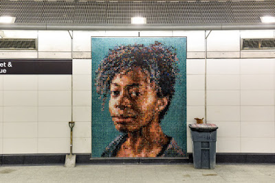 Not to be outdone by the colossal sculptures above ground, the just-opened 2nd Avenue subway station, itself an artful feat, has assembled a near-museum's worth of art, built right in, in the city's latest wave (and dare I say most successfully striking?) subway tile murals and mosaics. From Chuck Close (with several pieces, including his portrait of Kara Walker, above, and his own self-portrait, and composer Phillip Glass, below) to Vik Muniz, who's added an army of life-size but static commuters in his "Perfect Strangers" series (those two guys a little further above), the art is a destination in its own right, and has the potential to stop traffic faster than a sick passenger at Monday rush hour. Both the scale of the pieces and the overall undertaking are herculean, in a WPA kind of way, and it marks the first time in decades art was integrated from the beginning, not slapped up at the end. (See more of these amazing work-in-progress shots by George Etheridge for the New York Times, illustrating an article by Randy Kennedy.)

 Two years ago and slightly across town, in the New York Public Library's Rose Reading Room, a giant plaster wreath decorating the ceiling came crashing down, and became the martyr to a stunning makeover (which spilled over into the Bill Blass Public Catalog Room) in the Beaux Arts gem at the east edge of Bryant Park. Over the next 24 months, painters, gilders, woodworkers and engineers (overseen by the library's in-house architects and WJE Architects and Engineers) restored the room to its rightful place of the world's best library spaces (and I'm even including Trinity College AND Hogwarts in that list.)
But perhaps the most noticeable architectural additions to Manhattan above or below are the ones waaaay above: the brand new crop of pencil-thin residences for the Russian oligarchs, Chinese elite and domestic über wealthy, some popping up at the south edge of Central Park like exaggerated milk carton periscopes. Love them or hate them (the buildings, that is, not the oligarchs), these gravity defiers have already made an indelible mark on the city’s skyline, a living bar chart of the city's pockets of extreme wealth
Through art and architecture, finally– suddenly it seems– at least in Manhattan, the future looks like the future.
Hang in there! We’re half way through! Part 3, up next! (And if you missed it, Part 1.)
Photos: Design on a Dime: Peter Kubilis; Calatrava Hub: NY Times and Dezeen; Via 57 West: CityRealty.com; 2nd Avenue Subway: George Etheridge for the NY Times; NYPL Rose Reading Room: Ty Cole, for Architectural Digest.
Photos: Design on a Dime: Peter Kubilis; Calatrava Hub: NY Times and Dezeen; Via 57 West: CityRealty.com; 2nd Avenue Subway: George Etheridge for the NY Times; NYPL Rose Reading Room: Ty Cole, for Architectural Digest.


No comments:
Post a Comment