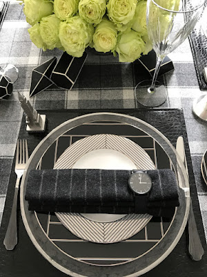
When my friends at Lenox showed me the newest china
pattern from Canadian star designer Brian Gluckstein, I jumped at the chance to put this setting in its place. Those
dishes were serving up all kinds of instant inspiration: Art Deco glitz, modern
geometry, and pure masculine swank, in a buttoned-up and dressy, cosmopolitan (and
martini!) kind of way. And I realized: in a sea of pastels, peonies and pretty,
why aren’t more tables styled for men? Can you style a tabletop so it’s actually
handsome? (and do it so you steer
clear of all the Mancave pitfalls?). I think so, and I think Father’s Day is
the perfect time to give the idea a business-dress rehearsal.
To the Closet!
The first place the Winston pattern seemed to point me was
the closet. Those stripes, the herringbone: it all seemed suiting-inspired. And
what makes a handsome man even more handsome? An impeccably tailored suit.
Since the china and the fabrics seemed picture-perfect for a sartorial pairing, I started to build the table the way I’d put together a suit: a charcoal base, some color, some brightness, some bling.
Suited... For Summer?
We first started talking
about this pattern back in much cooler months, when playing up the blacks and
giving it all dark and handsome backdrop seemed fitting, and season
appropriate. But then, suddenly, it’s summer. Could I hang on to the darker,
more tailored base (my great friend Mario, at New York Upholstery Services had already whipped up my table
linens, so those were definitely staying!) and not have the whole thing look
out of place or stuffy in June? How do you help a dark and mostly monochromatic
palette feel summer-appropriate?
One thing working strongly
in my favor: the plaid table cloth felt much brighter off the bolt and on the
table, and conjured up a classic picnic blanket as much as it felt like
suiting. Success! The white of the china felt as crisp as a classic white
shirt, and my oft-repeated “intentional white” held true: the white looked like
a decision, not a default, and kept all eyes on the dishes.
To keep the summer vibes
going, I turned where I usually do: to color. In this case, an unexpected dash
of chartreuse brought the summer sun right to the table. Those chartreuse roses
(they’re the “Lemonade” variety, though they felt more like limeade to me!)
brought some sunny, buoyant color to the table. Greens steer away from any
color/gender associations, too, and while I had white roses on my mind when I hit
the flower market for that same gender-neutral reason, these made for a sunnier, and far more
unexpected pick. To return to our suiting analogy, think how snappy a
chartreuse boutonniere would look on
a charcoal suit. But to prove the power of color, imagine swapping out the
green roses for red: that look would be perfect for next New Year’s, watches
and all... I’d add black and white hourglasses to join those watches and play up
the time theme.And even though the floral trend right now is bending more towards a carefree, windswept wildflower look, I still swear by a single mass of one color anything, a lot of look for the money, and easy to master even by the florally inept (a club to which I count myself a member). When you pick a flower with a woody stem (oh my!), and start with some floral oasis, the arrangin’ is easy.
Materials, Boy
For table or room, all- or
mostly-monochromatic success relies on texture, and this table sports lots of
them: Glass, silver, crystal, nubby wool and shiny alligator(-patterned textile),
and again, the sartorial parallels continue. Think of a wool suit, leather
belt, silver cufflinks. It’s not just the pieces that make a suit look good, it’s
the material contrasts, and proportions of those things.
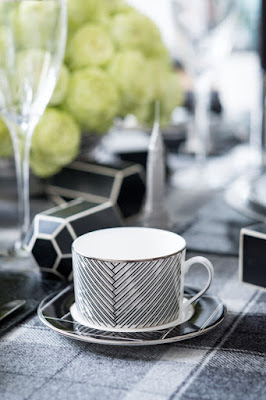
SkyscrapingThe silver herringbone of the Winston coffee cup and salad plate brought Art Deco and the Jazz Age immediately to mind. And Art Deco is built on strong geometries, snazzy angles and machine-age reference. When my thoughts wander to places Art Deco, visions of the Chrysler Building aren’t ever far behind. (I was definitely thinking of the Chrysler Building when working with Lenox’s Geodesia line back in December.)
And since I love incorporating “take-aways” in table designs... something guests can take home after the cognac is long gone... I included the super-detailed pewter miniatures from Replica Buildings at each placesetting. Against that Buxley plaid, those miniatures gave the whole tablesetting the feel of an aerial-view street grid. And speaking of grid...
Grid is Good
The geometry jumps off the plates, and the plaid and chalk stripe keep all that going. So did those Artists Blocks from Jayson home, the perfect prop to help break a tabletop’s basic formality (I love to scatter things across, around and through a table’s predetermined grid... it makes even traditional placesettings more fresh and modern.) And I’d imagine all the men at the table channeling their inner architects with these fun shapes.
Skip the Wrap... and the Biggest Takeaway! The geometry jumps off the plates, and the plaid and chalk stripe keep all that going. So did those Artists Blocks from Jayson home, the perfect prop to help break a tabletop’s basic formality (I love to scatter things across, around and through a table’s predetermined grid... it makes even traditional placesettings more fresh and modern.) And I’d imagine all the men at the table channeling their inner architects with these fun shapes.
I don’t know about your dad, but mine was generally unimpressed by fancy wrapping. That’s why I skipped the trappings and cut right to the chase: those Steel Blaze Swiss Quartz watches are there for the gifting, used as napkin rings. (Apologies to my friends at Hallmark for the no-gift wrap decision!).
I love that the biggest gift— those handsome
watches— are part of the wrapping, and finish off this table the way I would a
suit: with a great watch. This classic look manages to both settle in and stand
out, and end that eternal question: what to do with the napkin ring once the
napkin is put to use. Read more, and see more photos, over on the Lenox Tumblr page.
To all the handsome dads out there, I hope your Father's Day is well suited, and tailored to you!
To all the handsome dads out there, I hope your Father's Day is well suited, and tailored to you!
Full disclosure: I was
compensated for the styling of the shots for Lenox, but this blog post was my own unpaid doing! Photos: Michelle Fidman and Patrick J. Hamilton


