The audience ate it up with a spoon, and Lupone milked it for every inch,
strolling off stage, nearly dragging the spotlight with her. Chenoweth, of
course, ultimately more than holds her own, but truth is, not even a
full-fledged star likes to follow a full-blown Diva.
It’s a little like that at the 2015 Kips Bay Decorator Show House. Last year’s tour-de-force was
a real design milestone in the 43 year span of this grande dame’s run, a
stunning collection of gargantuan rooms and some of the most over-the-top
creative work by the likes of Juan Montoya, Ingrao Inc., Martyn Lawrence Bullard, Alexa Hampton and John Douglas Eason.
It was the hautest of the haute couture,
driven largely by the stunning shell in which it all unfolded, one of the storied
and legendary Villard Houses. And while this year was still more bespoke and
Savile Row than prêt-a-porter, it
certainly was a more livable, relatable space where you didn’t have to stretch
your mind muscles quite as far to find take-home tips or relatable rooms compared to last year.
How do you follow a diva? Doing what Kips Bay is known for: quintessential "Upper East" old-school decorating, and that's the script most followed.
How do you follow a diva? Doing what Kips Bay is known for: quintessential "Upper East" old-school decorating, and that's the script most followed.
The 22 design world stars this year played their roles well,
and the house still entertains, but it’s way more Chenoweth than Lupone:
lighter, breezier, not as deeply serious, intimidating or avant-garde as last
year’s. It’s still highly entertaining, with plenty of brilliance, wit and
design bravura. While there might not be a $1 million dollar fireplace screen like
last year, it’s still every bit a show house, albeit far more Bernstein
Broadway than Wagnerian opera, and still very much worth the ticket price, $35
to benefit the Kips Bay Boys and Girls Club.
The house returned to its roots in a way, ensconced in a typical East Side mansion. But “typical” in these parts still means five
floors, outdoor spaces, a never-ending oval of a showstopper staircase, grand and
ample rooms, and a cool $35 million price tag, even before the designer
trappings that came together in a nearly-miraculous four weeks from start to
finish.
The location, the Gilded Age Arthur Sachs mansion, feels
like a well-preserved house that’s been spared the often brutal surgeon’s knife
of never-ending reworkings, but in fact, the mansion experienced a
light-handed but total gut renovation, designed by Henry Jessup of HS Jessup Architecture, and finished by Interior Management, Inc.
just moments before opening its doors to the Kips Bay decorators.
Throughout, serendipity and coincidence lend the home a surprising
continuity not always found in show houses, and in that continuity, trends of
note and patterns worth repeating.
With only the fewest of exceptions (foyer, first-floor and top-floor landings,
a Keith Haring tiled powder room, and McMillen Inc.'s spare homage to Rio in an upstairs
bedroom) the décor is largely all- or mostly-traditional. Even some of the less
traditional rooms (by Charles Pavarini,
Alan Tanskley, and Thom Filicia) feel settled in, yielding
a net effect that’s vaguely vintage rather than brand-spanking new, and giving
the house the illusion that one owner (with some serious designer assistance)
brought these rooms to life over the years rather than cutting it all off one
bolt of toile or chintz. And while not to the degree of the 2013 house, it does give visitors a
lovely tour through time, although through a designer’s prism, not a slavish re-creation.
If you track this house for trend, there were plenty that cut through: Murals are back, gray's
still the neutral du jour, plaid is en pointe, African and tribal art is au
currant, and the rabbits of Hunt Slonem are still running strong. Palm fronds, whether Golden Girls lush or Chrysler
Building sharp, offer the ultimate design escape. Salon-style hangings are still amping up art collections. Patterns are
meant to be mixed. Cheery, cherry red is making a juicy comeback, thanks to Red
Queen Alessandra Branca and LA
designer Mark D. Sikes. Art Deco has
been refreshed with a lighter hand, and, it seems, every room should be designed for
multi-function, and one of those functions should be a bar. Another somewhat surprising repeat apperance: every single bed in
the house had some variation of tester or canopy, whether linear and spare or draped
and enveloping.
The men of the house turned it out in buttoned-up fashion. Alan
Tanksley and Kips Bay veteran Charles Pavarini both let their architectural
roots show while letting their artistic flags fly, Pavarini with a metal-leafed
wall of Ann Sacks travertine, a
stretched-membrane ceiling in his closet-turned bar and stunning
shagreen-embossed leather drapery (crafted by Anthony Lawrence Belfair), Tanksley with a fog-shrouded Deco-esque
mural on the interior of the sloped mansard roof.
Thom Filicia’s multifunction “modern library” also had a
foggy palette of mixed patterns with a modern menswear vibe. Filicia’s art was
some of the house’s gutsiest, if you were to separate the private rooms from the
public circulation areas of Ronald J. Bricke,
Paula + Martha, and Philip Mitchell, all three largely art
driven.
Filica wasn’t the only one to use gray. It showed up in a light to mid-range
value on the toile-inspired stairwell wall covering (a
surprisingly unifying backdrop for Mitchell’s two+ floors of floor-to-ceiling
artwork, a stellar example of the staggering skills of insider secret iLevel) and to an elusive deep and warm
gray (Tanner’s Brown, from Farrow & Ball) on the Christopher Peacock
kitchen cabinets.
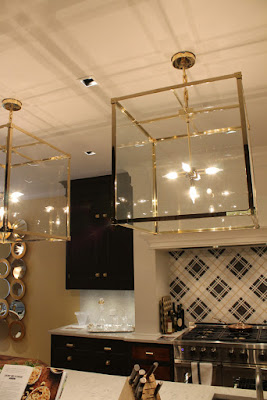
Plaid dotted the house, starting with the room-commanding,
custom-colored AKDO tile backdrop (one of several places this boutique tile house's intricate offerings glistened) applied
on the bias in the Christopher Peacock-designed, House Beautiful-sponsored and Silestone-clad
kitchen, which Peacock himself said was more “a living room you cook in.” Even
his oversized lanterns threw shadows of plaid onto the room's ceiling.
Upstairs,
Alessandra Branca deftly mixed tartan into a sea of refreshed and exotic
botanicals and ticking stripe, and on another floor, David Phoenix cocooned the man’s master bedroom with a pale gray-and-tan tartan
that struck the perfect masculine/feminine, winter/summer balance, grounding
the flighty, trippy and metallic Damien Hirst butterflies.

 With those tartans leading the charge, it was a good year for geometrics in a
house often known for chintz and cabbage roses, with an exuberant use of overscaled
but picnic-ready gingham in Mark D. Sikes’s vote-splitting formal dining room (showing off his
own wicker line for Soane Britain,
Sikes being the first American to design for the UK company).


Geometry took a more organic, global turn, with Sikes' paisley, and Tilton Fenwick’s own hand-block-inspired Zulla fabric for Duralee, covering the walls in their
tricky-but-tamed back stair landing, featuring a silk purse of a solution to
the room’s sow’s ear of wiring: raised conduits used as chair rail, softened
with Houlés fringe trim.
Global influences weren’t limited to the Best Marigold
Hotel-evocative Tilton Fenwick space. Ceramic giraffe-head vessels commanded Tanksley’s
layered room, which also referenced Greece, a nod to the room’s inspiration, Alexa
Hampton’s Greek-born husband. The expedition continued with Branca's beaded
and feathered African headdresses.
The elegant Hers bedroom by Cathy Kincaid featured a grand tour’s worth of souvenirs, Asian and otherwise.
The elegant Hers bedroom by Cathy Kincaid featured a grand tour’s worth of souvenirs, Asian and otherwise.
The globetrotting continued to Brasil in McMillen Inc.’s roof-deck-adjacent bedroom, and Michael Herold’s deep, dark and dramatic but TINY space, taken to the tropics with
the Cole & Son Palm Leaves wallpaper,
all very Midnight in the Jungle of
Good an Evil.
While last year’s house had a Whitney-worthy collection of public-scaled art
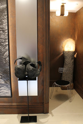
with a capital A, this year’s house made art, with a welcome trend toward sculpture,
a far more personal endeavor. And while Filicia upped the ante with a man-sized
(and -shaped) piece, smaller-scaled works of wood, plaster, stone and metal
showed up in Tanksley’s aerie, Branca’s lush tablescapes, Bricke’s yin-yang
of a stair landing, and Paula + Martha's mobius ribbon floating above the stairwell. But nowhere was the sculpture more personal than in
Pavarini’s hands: the multiple skyscraper pieces were an ode to his grandfather, the
start of his own architectural leanings.
Perhaps some of the most notable lessons of the house were
the importance of the “throwaway space,” and the value of imbuing even modest rooms
with multifunction. Almost every landing and elevator vestibule was designed
to stop traffic, not just move it. Tilton Fenwick created their perfect
roost for cocktails and gossip (evocative of Dineen Architecture’s drinks
lounge from 2013) from an awkward
back stair that might have otherwise been dissed and dismissed. And perhaps the
best space in the house? That walk-in closet-turned-geometric gem of Herold’s, proving
yet again that some of the biggest moments in show houses take place in the
smallest of footprints.
As for multifunction, Branca got a whole apartment’s worth of use (lounging,
dining, gaming, socializing, napping and more) by activating all four corners
of her room, while Filica and Tanksley turned office into a sitting room and
vice versa.
As in many show houses, the biggest risks displayed were not
from all-out design, but from quieter moments, none more spare than the top and
bottom (mostly) black-and-white brackets by Bricke below and Paula + Martha above, both
white-walled, and a true illustration of the oft-overused “curated.” When other
rooms jockey to outdo, isn’t minimalism, in a show house, a risk? Bricke put it
back in perspective, with a question: “Isn’t everything in design a risk?”
The other lesson of the house: the most noted, complimented
and remembered element was not what was brought in, but rather what was
built-in: that compressed and elegant nautilus shell and star turn of a
staircase, which not even salon wall or opening night crush of well-heeled
guests seemed to upstage. It seems to prove that if you truly get the bones
right, even bones as seemingly low-key as the polished wood ribbon trailing up
towards the skylight-capped top floor, anything works around it, but nothing
outshines it. Perhaps the diva does always get the last laugh, and the curtain
call. Patti would approve.
The Kips Bay Decorator Show House is open to the public through June 11, 2015.
Follow me on Pinterest and Twitter.
All photos: Patrick J. Hamilton
The Kips Bay Decorator Show House is open to the public through June 11, 2015.
Follow me on Pinterest and Twitter.
All photos: Patrick J. Hamilton


Brilliant! Yay Patrick Yay. Thank you for noticing the details.
ReplyDelete