Monday, July 23, 2012

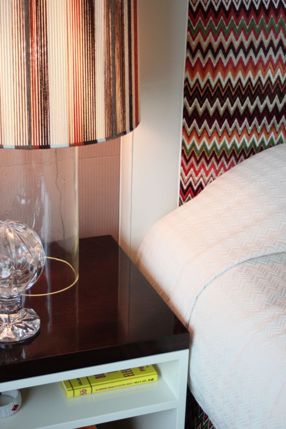
... about Rachel Doriss.


Listen in on my conversation with Rachel Doriss, textile designer and Creative Director of Pollack Fabrics, as she talks to Apartment Therapy about the Bed Stuy apartment she shares with her music-producer husband Joel and daughter Coco, about where she finds inspiration, and her deeply embedded love of the textile arts, just one of the many gifts she's plucked from her family tree.


See the whole Tour over on Apartment Therapy.

Thursday, June 14, 2012

...about theme decorating: out to the ballgame!

Theme decorating (especially when it’s a sports theme) can get a bad rap. And for some very good reason.  The celebration of sport, interior design-wise, is not always pretty, and it’s often a point of division (and not just of the Yankees/Mets variety), when one resident is more a fan than the other. Rather than arrive at a design compromise, many times “the sports room” becomes the den or home office that gets closed off when company comes unless they’re coming for game day. It doesn't have to be.
There’re the rooms designed to be a mini-museum of photos, memorabilia. Then there’s the little league: kids bedrooms built around a favorite sport or team... done right, a great inspiring space that’s positioned to grow as team loyalties change. Done not-so-great, these rooms can look a little like a birthday party exploded. 

Is it possible to create a tasteful room built on team spirit? I got ideas, how ‘bout YOU?! Warning: mixed sports metaphors ahead. And I will say "balls" a lot. Balls.

Relief Pitchers, Elizabethon TN, 1999, David Deal, from "Prospects: A Portrait of Minor League Baseball"
Inspired By the Game
I love the idea of peeling away the layers of a theme, and applying some design principles to make rooms that fanatic and non-fan can share without having to call in the ump. Any sport, its equipment and the places it's played present a whole toolbox of texture, color and shape from which to build, whether basement rec room or nursery. I love the idea of building a room from that toolbox, with shapes evocative of a sport, and not necessarily actual items or theme-y, literal and team-branded pieces by novelty makers. The sport of baseball is great source for these kinds of material inspiration: leather gloves and balls, exposed metal, simple shapes. And there are great pieces where the context makes the piece sport-driven. 

Above: Random Light Suspension Lamp, Moooi
Below: No. 46, by Don Hamerman
The Random pendant is seen without any obvious sports connection in many a contemporary interior, but against a blue backdrop of seamed wall covering from Maya Romanoff, and suddenly you’ve got yourself the start of a sports story. Add a Bertoia chair, and you’ve made a subtle reference to a catcher’s mask. Okay, maybe not sooooo subtle, but you get the idea. The bonus is that since these rooms are often the repository of lots of branded and busy memorabilia, these bigger, simplified shapes create a great backdrop and keep the shell of the room quieter, letting the treasured ball or bat or jersey stay the star.
Bertoia Side Chair with Cushion
Interior designer Joe Cangelosi agrees that it’s all about inspiration, not piracy: “Take elements of the client's favorite team. For example, Yankee pinstripes on the walls. Or use team colors as accents in your accessories.”

Like I advise in any design plan to keep a room cohesive, sports-themed or not, make sure anything you bring in has something in common with what’s already there. If you know the room will house signed red and white baseballs and autographed wood bats from your favorite Yankees, then you’ve already got your room’s palette: White, red and blue, with wood and leather (and the plexi of the display cubes) your potential materials.


Clockwise from upper left: Artifort 585 Chair, Geoffrey Harcourt; Baseball Chair, YoonJung Heo; Nut Pendant, LZF; Ball in Hand, David Deal; Maya Romanoff “Stitched II, Vinyl Wallcovering; “Rawlings,” Don Hamerman; Center, Bertoia Chair with Cushion.
Head Office
I like the idea of tackling a sports-inspired room as the design for a sports front office instead of a sports bar. Instead of a throw-away directors chair emblazoned with a team logo, make more grown up choices (like that classic Bertoia chair). Suddenly, you go from farm league to the majors, and even the non-sporting group will start to feel comfortable in the room, too. 


Clockwise from upper left: Bats, Amarillo TX, David Deal; Random Light Suspension Lamp, Moooi; Maya Romanoff Braided Hemp Wallcovering; Clybourn Desk, Crate & Barrel; No. 46, Don Hamerman; Bob End Table, Poltrona Frau; Bertoia Bench; Placentero Chair, Batti

New Jerseys
I love framed jerseys... IF they are framed well. Forego the multiple mats, color-matched frames and logo embellishments. A great jersey (or ticket or baseball card) looks best in a clean presentation... floated in a plexi box, or shadow-boxed in a warm walnut or black-stained frame. Modern, clean and simple is the best way to slide into home.

Ball in Hands, David Deal, from "Prospects: A Portrait of Minor League Baseball"
Framed Art
If you want to deck the wall of a room to honor Sport, but you’re not a collector of signed photos, look outside the sports memorabilia shops and turn to galleries and fine artists for images to anchor the space. There are some gorgeous images of players and places by some talented, exhibited photographers... Andrea Modica and David Deal show off their amazing eye and love of the game in pictures of farm league players. David’s images work at any size, but absolutely soar when blown up to three or more feet wide. The bonus of some of David’s outdoor images, especially when used large, is the illusion of adding a window to rooms typically devoid of them (basements and home offices). Home run. (I warned you.)
Bob Coffee Table, Poltrona Frau 
Color Coverage
Team colors are always big players in sports-themed rooms. Here in New York, we’re lucky to have two blue-and-white teams, easy to work with in large or small doses. But when your team colors are something a little more loud than you want the room to be, use them in smaller doses, tempered with lots of white, silver, wood and black. A purple and yellow jersey in a largely white room looks like a grown-up lives there. A purple and yellow room, notsomuch. So, like the Bud you down in the bleachers, know when to say when, or you end up with a sloppy mess.

Stratus Mini Pendant by Fredrick Ramond
But if you are adding team color, remember that color doesn’t just come from paint. I love the idea of a colored lighting fixture, like the Stratus Mini-pendant. But again, steer clear of the lamp made of a stack of baseballs. Save up for the collectors signed ball instead. In this executive office or mogul's media room, it’s about class, not kitsch.


Baseball-inspired Table and Chair, YoongJung Heo
The Thing’s the Thing
If the room’s destined for a serious collector and not just a fan, remember that the accessories will be the collectibles themselves, so go light on anything else you bring in, however tempting. Jim Fairfax, of Fairfax Designs, gives an example: “I worked with an attorney several years ago obsessed with baseball. The design for her home study became about the display of her collection rather than any sports references like team colors or patterns.” How did he make that happen? “Custom cabinets, spot lights on important pieces.” That included some pieces bigger than Jim had planned on. “During the design of this room the old Yankee Stadium began offering the physical stadium seats for sale. Guess where her season seats ended up? Front and center in the room. Those two seats were as important to her as someone else's 15th century collection of jade carvings.”

Bats, Amarillo TX, David Deal, from "Prospects: A Portrait of Minor League Baseball" 
Go Old Team
If your room is just meant to celebrate the love of sport, and not necessarily a favorite team, interior designer and blogger Brion R. Judge, of B.R. Judge Design and Bastion & Lark, thinks old is new: “I've only had one client that wanted a sports-theme room of any kind (thank god for little favors!) My solution was to find vintage sports pieces, old boxing gloves, a vintage basketball outfit ... a great vintage leather football helmet and things of that nature.” Plus, he notes, “these type of pieces help bring a bit of heritage into a space.” Aside from adding great texture and warmth, Brion likes them for what they don’t bring: “Most of these things generally don't have vivid, bright or gaudy colors (much unlike current sports gear) so they become neutrals in the space while still being focal points.”

While all these ideas are meant to make rooms where taste levels rival team spirit, ultimately they're meant to be rooms built on fun, spirit and personal style, and Jim doesn’t disagree that it's okay if spirit trumps style. “Design for me is always about creating spaces that celebrate a client's passions. If sports touches someone's heart, the theme isn't important. It's all about the celebration. Why not put it on display?”


Whether it's sports-, travel- or, well, anything related, there are plenty of ways to keep themed décor stylish, grown-up, and in a room you'll be happy to keep open all year long. So maybe "theme décor" isn't an oxymoron after all. Balls.

Get social! Find Fairfax Studios, Joe Cangelosi Design, and B.R. Judge Design on Facebook. 

Thursday, May 31, 2012

...about "downstyling:" Deborah Needleman at the Decoration and Design Building


Her title: Editor in Chief of WSJ. Magazine, the Wall Street Journal luxury lifestyle title. Her legacy: the masthead matriarch of Domino. Her book: The Perfectly Imperfect Home. Her keynote at the D&D Spring Market: all about where luxury fits in, in the grand scheme, designer’s toolbox and Manhattan apartment. It was an interesting conceptual take on what everyone is always hungering for from editors and industry insiders: What’s new, what’s next? What’s the new It, the next Trend?

But Ms. Needleman avoided the “T” word, making no color forecast, no prognostication of the Next Big Thing. Instead, she talked about where she finds relevance and inspiration as she curates the story of good living to her blue chip readership (with great and growing numbers, per the excited publisher in his introduction of Ms. Needleman). But inspiration is not necessarily, from this interior design maven, where you’d expect she’d find it. Her muses of the moment? Fashion photography, the fashion runway, and food trends.
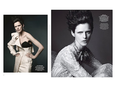
 
From fashion photography, via a recent couture story from WSJ, Ms. Needleman talked about today’s kind of elegance... unadorned, tough, edgy. The photos, shot against bare backdrop and with a barefoot Stella Tennant, were used to show the swing between classic elegance and a contemporary air. “It’s about,” she said, “the tension of beauty and mood.” Ms. Needleman called Tennant “a woman with a real life,” and cited her athletic, Amazonian presence, palpable strength and unexpected dyed-white brows as the reasons why these shots were a new-school take on Old World elegance.

 
What’s the interior connection? According to Ms. Needleman, even a dressy traditional space needs something in counterpoint to keep the excess at bay. Her “Do” illustration was a room at first glance every bit as decadent as the “Don’t,” but Ms. Needleman picked out the quirk and charm she said made the interior a new kind of luxe: mismatched sofas, contemporary Schiele portrait, and a lived-in sense of comfort. In this example, it seems, the English, with their layered country homes, have it right, even right now. “Now is the time for charm,“ she said, adding an apt rallying cry for the room of assembled decorators, “and more pillows!”

  
In contrast, she flashed a “Don’t” image of unadulterated tradition, more Crystal Carrington than Duchess of Windsor, with an air of conspicuous consumption that might give even Gordon Gekko pause.


From fashion’s runways, the same sort of connection (softness with an edge, and vice-versa) but she also used images where a humble or “sweet” material was used architecturally, and without apology... an allover print, lace or floral. What she saw on these runways was something “decorative, yet puritanical,” and “an elegance tempered with simplicity.”


The rooms she used in concert were more of the same: chintz or florals used with abandon, or humble made chic, and in Ms. Needleman’s estimation, made fresh and new in the celebration of the simple. She was quick to clarify that these comparisons were about “letting something simple speak,” and that they were meant to be more ethereal examples and less literal connections than Domino’s “Turn this outfit into a room!” feature, although the difference did not seem all that defined... just a touch more upscale.


And finally, food. Citing farm-to-table movements, gastropubs and the hyper-specialization of the likes of olive oil stores and meatball shops, Ms. Needleman made a delicious case for the same kind of living: a celebration of “honest” materials, and rooms where the function is clear and celebrated. A stripped-down but sunlit room, with vintage soaking tub provided illustration. “This room is about bathing, and the pure joy of the Bath.” She got lots of nods from the room when she said, “Who doesn’t love a bath?”


There were tie-ins here, too, to the runway concept of using one “ingredient” and running with it (chintz or pattern or function substituting for the meatball in the metaphor).  What it’s now about, said Ms. Needleman, is “simplicity, authenticity, a narrative and sense of place.”

But what of all this authenticity? Is that a relevant topic to a roomful of people charged with spinning yarns for their clients with imported textiles and custom-made pieces, much from within the walls of this top-tier and trade-only building?

There seemed to be in many of her examples a statement, too, about femininity: that something sweet can be strong, no explanation necessary. Along those lines, and with a slight apology to the handful of men in the packed room, she said, “It’s a good time to be a woman decorator,” going on to say, “women think more about how people use space.”
 
The idea that rooms are meant to be used, frayed edges be damned, and her mantra of “perfectly imperfect,” the essence of Ms. Needleman’s book and at the root of her keynote, all rings true when we are pressed for time and tight on budget. But Ms. Needleman’s examples still felt quite aspirational. The same could also be said of Undecorate, the book by DwellStudio’s Christiane Lemieux, where each interior seems to try to outdo the next for how “unstyled” the highly styled interiors could be. Likewise, those shots of supermodel Ms. Tennant were done by the absolute best in the business, with staggering day rates and a cast of many, all in the interest of “simplicity.” To paraphrase Dolly Parton, “It takes a lot of money to look this undecorated.”


And, apparently, it takes a bit of cash to live this simply... English manors, Spanish country homes, rolling family estates, and Porthault linens were the images on the screen. No connection was necessarily made to how to get these couture ideas right off the rack, in a building of high-end sources where a CB2 recently moved in just downstairs.


It seems also, to be about context: a threadbare sofa seems chic and terribly unaffected in a manor on the Scottish moors. In a Manhattan studio, something gets lost in the translation. And if not context, maybe backstory. That “real woman” Tennant? She’s the granddaughter of Andrew Cavendish, 11th Duke of Devonshire and Deborah Mitford, the last of the noted Mitford sisters.

 
It’s also all interesting, in the context of Ms. Needleman’s past with now-folded Domino,  a casualty of the tough times besetting the shelter-magazine world. Domino had a DIY and budget vibe (The scripty captions! The exclamation points!!!) while heralding designers who wouldn’t take a commission under $10,000 (and up) in fees alone for a single room. It seems that high/low disconnect possibly led to an advertiser/reader disconnect, too.

Is all this intentional “downstyling” a self-conscious apology for wealth in an Occupy Wall Street world? Or is it just the next iteration of tradition through the lens of a new generation? Is “It’s time to lighten up the luxury” just a way to address a still-faltering or stalled economy or a return to something real? Choice, or necessity? Not sure, but interesting to consider. Is, as Ms. Needleman suggests, the idea of “indulgence” as dated as the shoulder pads of Dynasty? Or is the attempted avoidance of looking indulgent just a shtick and charade, like the court members of Versailles dressing like peasants for kicks and giggles? Or maybe this is just what luxury and style will look like when our newest wave of Facebook-funded millionaires start hiring designers and showing their lofts off on The Selby.

Granted, “budget” is a HIGHLY subjective topic, especially in a design building (where later in the day, curator-extraordinaire Murray Moss touted the "simple" joys of $200 drinking glasses, although his namesake store Moss, which used to sell those glasses, is now defunct) and another presenter talked about the issues of removing her MoMA-caliber collection to make way for her daughter’s at-home birthday party. I just wish the connections to a different tier of client had been made, by someone, somewhere. But maybe, to this audience, that would have been sacrilege, like bringing a GAP shopping bag to Fashion Week.

Later in the day, I spoke to the connected and buoyant Suzanne Sokolov, of Boost Marketing, and she talked about a rising vibe of similar “authenticity” in the interior blog community, specifically, “Things I’m Afraid to Tell You,” a viral confessional of sorts where some of the blogosphere’s best admit to not being able to make rent or afford the luxury goods they’re all-a-Twitter over, among other things laid bare, publicly. There seems to be the desire for honesty there, too.

Are we ready for al this honesty, and a new kind of warts-and-all, perfectly imperfect, downstyled luxury? Not sure. When times are tough, there's something, sometimes, to be said for aspiration and a little bit of artifice. I do like, though, the idea that definitions of beauty and good design need a good airing out every now and then. Just like those English Country homes.

Get social! Find the D&D Building and WSJ Magazine on Facebook.

All images, except for the event photo and the D&D Building/CB2 image: WSJ.Magazine, from Deborah Needleman's keynote presentation, used with permission of the D&D Building.

Tuesday, May 29, 2012

... about a West Village home.

I talk to John Behan and architect David Burdett of DAS Studio as they open their home a second time to the readers of Apartment Therapy. Their West Village 30s era apartment was reworked and fine tuned, by decor and design,  to better suit the duo, and make an apartment live larger without moving or removing a single wall.

David, Part 1
David, Part 2

John

See the full House Tour here on Apartment Therapy.

Friday, May 25, 2012

...about "it's all in the details:" Kips Bay 2012


Today, I'm letting the images speak for themselves, and let the pictures do the heavy lifting. I posted already about what the take-aways were for the Kips Bay Decorator's Showhouse 2012, when top designers tackled new construction. But aside from the overall rooms, I love the "moments" in showhouses... an item, a vignette, a detail, a chair, a juxtaposition. So without further comment, my favorite moments of Kips Bay 2012. (Pictured above: David Scott's study.)

Patrik Lonn
Laura Bohn
Coffinier Ku Design 
Neal Beckstedt
Neal Beckstedt
Scott Sanders
Scott Sanders
Alexander Doherty
Brian Del Toro
Alexa Hampton
Jamie Drake

Jamie Drake

Raji Radhakrishnan
Raji Radhakrishnan

The Show House runs through June 14th, 2012. Hours are Monday through Saturday, 11 a.m. – 5 p.m.; Tuesday and Thursday until 8 p.m.; Sunday, Noon - 5 p.m.

Get social! Find the Kips Bay Boys & Girls Club Decorators Show House on Facebook. And read my full tour here.