It sounds like a scandalous entry on a society page: “Grand
Dame moves West, has major work done to conceal flaws and hide age.” But this
bold-face name and the grand dame in question is the annual Kips Bay Decorator Showhouse, to benefit the Kips Bay Boys and Girls Club. It’s historically (with
one slight but still-east detour, to a white-brick mid-century landmark
building) been staged in brownstone, mansion or townhouse, all typically
offering built-in grace, plaster molding, fireplaces and aged parquet. But this
year, a new box was wrapped around the event. And new it is... the 40-story
Aldyn still has that new house smell, and (until early June) is the site of the
city’s swankiest Model Apartment. Two, actually. A pair of 6,000 square foot
mirror image two-story homes that NY Times deemed, “each equally unpromising in
architectural terms.” They’re the modern stage sets for a cast of the décor profession’s
premier players, strutting their stuff to garner attention, ink and clients.
But the age concealment here was not the typical nip and
tuck in the quest for the fountain of youth. Quite the opposite... the
designers seemed to want to add a
sense of history and grace of age to a basic white box (if you can call
sweeping river views, double-height living rooms, sneak peaks onto private rooftop
lap pools and private terraces “basic.”) and there were several tricks trending high, and all lessons in how to take the edge
off of new construction.
So how did premier decorators
and designers tame the sheetrock beast?


No Wall Untouched
Charlotte Moss did it with faux
a boxwood hedge and trompe l’oeil barnboard wall covering that you’d swear you
could still get a splinter from. Bryant Keller did it with a scattering of
zebras. Raji Radhakrishnan of Raji RM Interiors did
it with venetian plaster, turning her box of a room into the inside of a
luminescent, magical pearl. But whatever the finish, the walls were the stars
in all but a few rooms.

Mere paint appeared in only the
briefest of moments (the rare column walls, and Todd Alexander Romano’s deep aubergine)
but otherwise, walls got serious treatment where there was no cove molding or
raised panels to provide vertical anchor. Grasscloth is still big (Phillip Jeffries still apparently the grasscloth go-to), but there was a definite lack
of upholstered walls. Smooth new construction gave no good reason for this decorator trick when older walls are past repair, although an upholstered panel acted as backdrop for the main art in Jamie Drake's emerald green study.


Designers know that treated
walls give texture to rooms with no chair rails or crown, but they also took
advantage of the opportunity to layer on some history and story telling. Bryant Keller’s entry sported that bold red iconic Scalamandre paper to hold attention
in a high-traffic showhouse, certainly. But it was a nod to the past from one
of the assembled grouping’s younger participants. That paper is as much about
the history of New York’s interior design community as it was about a newcomer’s
grand gesture.


Proving that subtle can also
grab attention, Brian Del Toro did a tone-on-tone plastered grid of an earthy
blue in one of the Showhouse’s most understated, but designer-talked-about
rooms, no doubt taking color cue from the lap pool just past the window.
Parchment-sided chairs and shocks of lime, all reflected in a showstopper
mirror made this subtle room memorable.


Charlotte Moss seemed to have the
most fun of anyone, creating an owl-inhabited, hedge-walled study, a room just outside Hogwarts if Hermoine and Ron could afford the going design rates of these high
powered and big ticket decorators.

Ask The
Panel
When life does not give you paneled libraries, you build
them yourselves. But these were modern applications, not faux recreations or
Metropolitan period rooms. Alexander Doherty used the wood du jour, a paler or cerused
oak, for his quiet grid, and so did David Scott, channeling all the warmth and charm
of paneled rooms with none of the dusty, dated baggage.

The Longest Yard
The bold repetition of an even
bolder fabric can give a room a sense of architectural presence, and both Scott Sanders and Ed Ku and Etienne Coffinier of Coffinier Ku Design took fabric and bolted with it.
Scott’s bright ode to summer and (for this South Floridian) a citrusy conjuring
of Miami in his “Cabana" (most likely a guest bedroom, and ensuite bath on the
floorplan) spilled from one Scalamandré fabric.


Missoni Home was well-represented in the Coffinier Ku room-cum-product
celebration, where an amazing lace-back embroidered fabric took several star
turns, fabric-backed and applied to uninspired builder’s basic doors, and left
unfettered at the windows, the perfect flighty backdrop to an installation of
Baccarat butterflies.

Ginormity
Come home and go big. That was
the strategy of some, using heroic scale as architectural stand-in, or to hold
a room’s own against double-height walls. Susan Zises Green brought her high ceilings down to scale with giant mirror and big columns of framing drapes.

Todd Alexander Romano used over-sized
pineapple, giant slices of geodes, grand chandelier and Bustamante brass giraffe to tame the scale of a silo-esque room
he had quipped to the New York Times that he originally wanted to “paint gray
and fill with corn.”

And Raji Radhakrishnan filled a
builder’s bump-out edge to edge with a mural, adding to the storytelling air of
this poetic room and making it seem the designer had actually requested the
frame’s odd existence.

Walk Off the Floorplan
Sometimes the best way to make
new construction work is to ignore the builder’s intention, or at least make it
more personal. James Rixner took what was most likely pitched during a real
estate walk through as an eat-in kitchen, and turned it into a bright but cozy sitting
area. Were I the resident, I’d be in this room a LOT.
It was also one of many places where lime green added twist to the tonic (see “Green
is Good,” below).

New Tapestry for the Modern Castle
While no one was using
tapestry-like installations of draperies to kill a castle’s chill, all used it
for regal air. But these are not your Tudor’s swags and jabots. In the jointly
designed living room of Bunny Williams, Brian J. McCarthy and David Kleinberg,
a draped wall and tapestry conjured up a modern castle, and the collected
spirit of Albert Hadley, the honoree of the room’s design.


Draped walls were
also used in Thom Filicia’s entry, an unlikely but working mix of menswear fabric and
tribal rug.

And Alexa Hampton/Mark Hampton used tapestry-like draperies to create a sense of
enclosure in the Master Bedroom, and also to balance a room sided by three
windows.
Turn your Back on the Window
Like the Hampton room comprised
of mostly window walls, several designers lost precious furniture-anchoring walls
to floor-to-ceiling glazing. Neal Beckstedt, in one of my very favorite rooms
in both units, employed one of my favorite tricks: a wall of sheers to make
window into wall, and furniture placement no obstacle. He also displayed a big
piece of art on the main vignette, and it was the draped backdrop that made
that make sense.


While some would cry foul to covering a view, this home has
many... and by draping one, Neal distilled the view to its absolute best...
the sweeping view down the Hudson, where the day I shot and I’m sure many days
after, one cruise ship was perfectly placed just beyond a slice of rooftop
pool. Plus, even draped, the
windows and views still sparkle and shine. (Sidenote: That wood lamp! The
hallway console! Neal gives GOOD vignette.)

Lacquer or Leave Her
Shine, on. Alexa Hampton for
Mark Hampton lacquered their East Side homage with a deep battleship, and Thom
Filicia and Jamie Drake were also among the high glossers (some lacquer, some
paint, some plaster, but all high shine, no doubt magic when evening falls.) My
friend and industry insider Lloyd Marks unlocked the mystery of why so much
lacquer on the walls of this year’s Kips Bay, and it was practical one, born of
the home’s newer vintage: New walls provide a smooth-enough canvas for this
mirror-like application. It’s not always a viable option in the older homes
where Kips Bay normally takes place.

Lynne Scalo, of Lynne Scalo Design
brought the shine in one of only maybe a trio of white rooms, with lamé lounge,
gold table and vintage glass, on loan from Culture Object.

In a brave move of full disclosure, she let the
window unit HVAC hide in plain sight, and it stood out in the art-inspired room
like a chic installation.

Green is Good
Split pea, lime, grass,
emerald, acid and poison: green was a Go. It was Emerald City all up in here,
with green in all its glory as the
runaway color story. Anchor (like in Laura Bohn's kids room) or accent, the strong take on this secondary color
seemed to be the way designers were dealing with a lack of green views, or demonstrations
that designers understand strong color can bring an architecture all its own.

Just Add Age
Most, if not every room save
for the kitchen by Robert Schwartz and Karen Williams for St. Charles featured
vintage or antiques, patina’d woods and the depth an “important” piece lends a
room of any era.

The most successful designs, in
this modern assemblage of rooms, seemed to be the ones where at least a nod was
made to the fact these are brand new rooms. When “Upper East Side” was loaded
in and layered on, without any reference to modernity, the union of room and décor
wasn’t necessarily the happiest of marriage. Patrik Lonn managed to go
largely traditional and it still worked well, owed in part to gorgeous
parchment pieces, European antiques and the timeless grace of fine dining. He also is on trend with settee as dining perch, in a move that seems both totally modern and Gilded Age graceful.
 |
The quirks of an older house sometimes lend themselves
better to the design schizophrenia that sometimes comes from unleashing 30 or
so designers in the city’s biggest interior design tour de force. Here, rooms
spilling from one to another created some jarring transition, but that just made it
the chicest of chic fun houses.
 |
| The St. Charles kitchen |
Success or failure (although no real failure here), I loved
this year’s Kips Bay Decorator Showhouse, since in this bright shiny tower and
all the white boxes inside, it was a real decorating
assignment... no unbelievable Before and Afters, of the transformation of a
room where years have changed its shape and function (you could still see the bones of each original room) and no architecturally
grand detail to start the conversation or save the day. The designers and
decorators had to ship it all in, apply the patina, use the tricks of their
trade and art of their eye to make the most of rectangles and squares, with the
reality of vents, switches and HVAC units all fully in the mix.


A few notes of absence: while
last year’s House seemed to be highly art-driven, this year only a few pieces
stood out for art’s sake, in Jamie Drake’s and David Scott’s separate studies.
I guess with those views, art does take a back seat. And draperies were largely
simple, wall-colored or white, sheer and unfussy, again, owed to the views. (Lust alert: The blue zebra rug by Carini Lang!)
Somehow, on my afternoon of
shooting (that also involved dodging President Obama’s post-The View motorcade
before rushing off to the Alpha Workshops’ Annual Alpha Awards) I missed Shawn Henderson’s
room completely. I’m going back for Shawn. Um, Shawn’s room. And for more lessons on making “new” feel “lived in,”
beautifully.
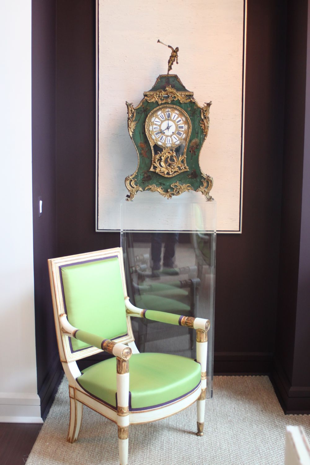
In one of my favorite “moments" in the entire house, Todd Alexander Romano floated an antique clock on a
contemporary acrylic pedestal, like a magic trick. It was an apt metaphor for
the Showhouse itself, where time and age were in the spotlight and discussed
over blueprints, cocktails and walk-throughs. Here, new construction, ageless antiques,
industry legends and new players all met somewhere in the middle. And most of the
time, found the magic right at that intersection.


thanks for the comprehensive peek inside, patrick!
ReplyDeleteWonderful post Patrick. I feel as though I don't even have to go now....not that I was...but if I were, this is good enough to make me opt out.
ReplyDeleteExcellent post, Patrick.
ReplyDeleteI just returned and posted my observations as well.
I also noticed that most ceilings were somehow addressed & not left plain. Even just subtle metallics took them to the next level. Also blown-up digital photos, as in Raji's room, created instant depth to the rooms.
I was mesmerized by the beautiful, barely off-white Venetian plaster in Raji's cozy room- a stunning, subtle treatment.
Ann! Welcome, and thanks for adding your insight. So many take-aways at show houses like Kips Bay!
Delete