There are some designers whose style is so recognizable you
can spot their rooms 20 paces out or 2 pages in. John Saladino. Vicente Wolf.
Darryl Carter. Geoffrey Bradfield. Over decades of fine-tuning their process,
they’ve arrived at go-to palettes, styling trademarks, and furnishing
combinations that work for them and for clients seeking that signature style.
Not that there’s anything wrong with that.
But to me, the joy of interior design has been uncovering and
then celebrating the passions and loves of my clients, in rooms that shout or
whisper their names before they do
mine.
While of course the bulk of my work has been for (mostly!) wonderful clients, I’ve also been lucky to work on projects where style or function restrictions have been nearly nil, for pure show or charitable cause... the Bloomingdale’s Big Window Challenge, Holiday House, and this, my fourth year doing Design on a Dime, the annual fundraiser to benefit Housing Works, where 50+ designers solicit merchandise to craft, collect and curate a vignette, art installation or mini room, all sold off for charity.
But in each of these events, it’s basically just me (well, me and the amazing donors, artists, antiques dealers, volunteers and craftspeople who make it actually happen!).
There’s no client to say, “We have to keep the rug,” or “Anything but green.” Style-wise, I get to fully call the shots (and
then, in the case of Design on a Dime, beg, cajole and wish, then cross fingers
and toes that vendors will say yes and it all arrives on time.)
It’s what makes these type of “no-client” events so thrilling. And so terrifying. It’s just me. And, ohmygod, it’s just me. No one to throw under the bus but myself if the collection of items that looked so cool on Pinterest fails to translate in the 3-D world.
It’s what makes these type of “no-client” events so thrilling. And so terrifying. It’s just me. And, ohmygod, it’s just me. No one to throw under the bus but myself if the collection of items that looked so cool on Pinterest fails to translate in the 3-D world.
Each year, I’ve let myself have more and more fun with the unfettered
prospect. My first room for Design
on a Dime was quiet (but a debut I’m still terribly proud of). The next, alligator walls and egg yolk yellows. Three years later and one year ago, I
was hanging a giant green parakeet on a flamestitch grasscloth called Zippity Doo Dah. Quiet? Notsomuch. In
my fourth year, I’m layering floor length white fringe panels over “Brazilian
Blush” walls.
It’s been fun, but it made me wonder: am I a design Sybil? What’s the common denominator, of my client work (whether on short or long leash), the Design on a Dime vignettes, and the other opportunities (like my own home) when there were no clients at all?
It’s been fun, but it made me wonder: am I a design Sybil? What’s the common denominator, of my client work (whether on short or long leash), the Design on a Dime vignettes, and the other opportunities (like my own home) when there were no clients at all?
With or without a client, do I have a
signature style?
When I stopped to think about it, I realized there are some things I love to do, some
tenets I try to hold fast to, some groundwork I generally lay for a room,
myself, or a client. So, by way of this year’s Design on a Dime vignette, here
are the thirteen things that, to quote the Pet Shop Boys, “left to my own
devices, I probably would.”
 |
| Photo: Jody Kivort |
1. Natural elements
Pardon my French, but Mother Nature kicks ass.
I love what the rich irregularity of nature brings to any room, whether wood grain or glittering frozen fractal. This year, it was a calcite geode and two beyond-belief rock crystal spheres from Pagoda Red. Two years ago, it was the spectacular and herculean “Painter’s Stone” (also from Pagoda Red. They’ve been very, very good to me.).
I love what the rich irregularity of nature brings to any room, whether wood grain or glittering frozen fractal. This year, it was a calcite geode and two beyond-belief rock crystal spheres from Pagoda Red. Two years ago, it was the spectacular and herculean “Painter’s Stone” (also from Pagoda Red. They’ve been very, very good to me.).

Pieces from nature, whether seashell or fossil, petrified
wood table or selenite lamp, temper a modern room, and bring a note of color,
shine or texture you simply can’t man-make. Same goes for plant- and
vegetable-based dyes, like those in the silk “Double Portal” rug from Carini Lang. Nobody does color like Joe
Carini. Or Lady N.

Nature brings grace, ease and a settled, well, nature to any room. I even love the
power of photographs of animal, vegetable and mineral to bring it. But it can also
be as simple as a vase-full of flowers.

2. Art as
palette-driver
As I said when I had the opportunity to speak on the subject
recently at the New York School of Interior Design, if I could, I’d start every room with art. It’s hard
though, since finding perfect art that a client loves as much as you do is like
finding a pair of shoes someone else thinks is comfortable. It’s usually too
personal to project.
So when no client is around to say, “Ummmmm...” art is very often where I start. This year, Dan Romer’s “Lord Rick” set the tone of the room, with both his princely nature and unique clay-pink, gold, silver and black palette. The Bloomingdale’s window, my first year of Design on a Dime and Holiday House all started with the room’s main piece (or collection) of art.
 |
| Photo: Jody Kivort |
3. Repetition
Since I very often work in smaller confines for Manhattan
clients, repetition, whether of shape, theme, color or texture, is a way to
bring cohesion both within a room and from room to room.

Dan’s drawing, and my second donation, that crazy-spiky-cool
Spore mirror from Barry Barr Dixon
for Arteriors Home shared an organic,
elongated oval, paving the way for the irregular oval of the River Stone cocktail table from Mitchell Gold + Bob Williams, the Mobius sculpture from Oly, the
foreshortened disks of the Revelry lamp from Currey & Company,
and even the silvered Jordan almonds.
That thorny crown worn by Lord Rick, and the spikes of the Spore gave me yet another royal and wicked motif worth repeating (in the pointy little crowns of the Lily candle sticks from West Elm, and the base and finial of the Currey & Company Minaret lamps).


Black and white (more on that later!) was repeated in the
traffic-stopping diptych from Karina Gentinetta, the Conor zebra chair from Bernhardt,
and the pair of fuzzy Frida chairs from Mitchell Gold + Bob Williams.

4. Wall-matching the
big stuff
Again, a small space trick: steal the potentially overwhelming
mass of a room’s largest pieces, whether upholstery or casegood, by matching or
relating it to the wall color. This year, the champagne upholstery on the
Mitchell Gold + Bob Williams Henri
chairs wasn’t as direct a match to the walls as last year’s orange leather
settee, but these two chairs would have seemed even bigger in this tight 10 x
12 footprint if they were bright blue.
 |
| Photo: Jody Kivort |
5. Console(ation)
Prize
To anchor a wall, or hide AV equipment, and do it while
providing places for all those lamps and tablescaping, while hugging a wall and
not hogging the floor, who you gonna call? A console. Closed or open, it’s a
great casegood. And while this year’s star Jules
console table didn’t match the wall, its openwork base, glass top and super
slim profile stole the thunder from its considerable length.

6. Animal magnetism,
and a horse of a different stripe
With apologies to my vegan friends and PETA (and no comments
from the peanut gallery, please), I like leather. Well-tanned and au naturel (shush!), aniline dyed and
hair-on-hide: I love what the non-fabric nature of hide and its hardwearing
(and kid-proof, pet-friendly) properties can bring to a room.
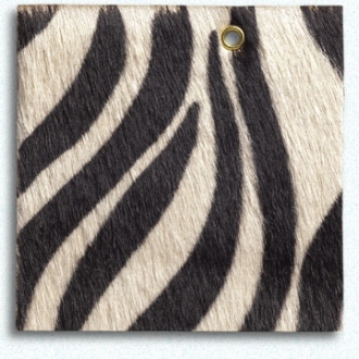
And to me, any and every room benefits from the exotic and graphic pattern of zebra. Just legally vintage, woven in rug or fabric, gilded onto the Gold Carnaby Zebra Stacking plates from Jonathan Adler by way of D.C. designer E. Wayne Breeden, or printed on cowhide, please. The best use of zebra is still on a living, breathing zebra.
And to me, any and every room benefits from the exotic and graphic pattern of zebra. Just legally vintage, woven in rug or fabric, gilded onto the Gold Carnaby Zebra Stacking plates from Jonathan Adler by way of D.C. designer E. Wayne Breeden, or printed on cowhide, please. The best use of zebra is still on a living, breathing zebra.
 |
| Photo: Jody Kivort |
7. A “bridge piece”
To make sense of bright- and off-whites I knew were coming
but wouldn’t see until cracking open the boxes during install, I relied on two
things already covered to make sense of the range: art, and nature. I knew
there’d be bright whites and creams among the arrivals, so Karina’s paintings
(which combined both) and the natural whites of the cowhide chair and geode
were the pieces that made the mismatch look intentional. Another of my usual go-to bridge pieces is an area rug, making sense of a room's disparate tones.

The astounding, castle-worthy frame from Lowy was also a bridge piece. Its
white-gold gilding made sense of the mix of metals elsewhere in the room, as
did the champagne tones of the Henri
chair’s upholstery, and the Crate & Barrel Orb champagne bucket.
 |
| Photo: Jody Kivort |
8. White (and black) as
color
White should never be a default, even if it’s the builder’s
basic on your rental walls. It’s the non-color color worth running with (just
ask Benjamin Noriega Ortiz.). The
designers at Apple taught us that white could be an oh-so-intentional style
choice, as white ear buds sprouted up like snow drops in the spring earth.
I’ve always agreed. White can temper a riot of color, or draw your eye in from dark corners, making the edges disappear, as they did at Holiday House. Last year at DoaD, white frames made sense of a crazy-quilt of a gallery wall, while holding their own against the wallpaper. The white shag underneath all that jazz calmed things down like sour cream on spicy salsa.
I’ve always agreed. White can temper a riot of color, or draw your eye in from dark corners, making the edges disappear, as they did at Holiday House. Last year at DoaD, white frames made sense of a crazy-quilt of a gallery wall, while holding their own against the wallpaper. The white shag underneath all that jazz calmed things down like sour cream on spicy salsa.

Same goes for black: it can ground, steady and de-sweeten an
otherwise frothy confection. Without black in this year’s room, it all might have
read far more spoiled Tween than the intended (and more mature) “Wicked Queen.”

9. Are we all lit? Statement lamps...
and get me to the pharmacy
Why does furniture always look great in showrooms? Lighting.
Direct, indirect, shaded or spot, incandescent, LED or halogen. And lamps. A
room’s best friend is the glow of a paper or fabric-shaded lamp, and people
never use enough of them.
As a testament to the power of lamplight, even in the bright lights of the Metropolitan Pavilion, the crackling and spot-on color work of booth neighbor Miles Redd only really came to life when his lamps where finally lit.
As a testament to the power of lamplight, even in the bright lights of the Metropolitan Pavilion, the crackling and spot-on color work of booth neighbor Miles Redd only really came to life when his lamps where finally lit.
Aside from the lighting they provide, lamps are truly the
jewelry of any room. Lamps add color or shine even when they’re not even on.
And don’t forget to consider the color of the shade. White or ivory, silk or
hardbacked, basic black or foil-lined, consider the shade’s color when the lamp
is off and on. (Thank you, e-tailers,
who photograph product shots both ways.)
I’ve also used at least one version of the classic pharmacy
lamp in every single room I’ve ever finished. The perfect kind of light for
readers, and when table-tops are in short supply. (This year's pharmacy lamp is just out of frame, sidled up to the Conor chair.)
 |
| Photo: Jody Kivort |
10. Masculine/feminine
mix
I’m not thrilled with assigning gender roles to things like
straight line versus curve, bold versus delicate, floral versus geometric (and
ESPECIALLY not color), but “masculine/feminine” is still a kind of universal
shorthand for these types of style attributes.
Any kind of mix is
important to keep a room from feeling like it all fell off one truck, but
nothing’s more important than the mix of (for lack of a better term) of
masculine and feminine.
Every room needs both, not only to make everyone feel at
home, but to create the good kind of “sexual” tension that makes any room far
more sensual.

11. Wall power
I’ve relied on statement walls mainly at Design on a Dime
for two reasons: I’ve had a donor, and wallcovering, while it slowed up the
install, always turned “booth” to “room” as soon as the last seam was matched.
Along the way, I’ve been fully converted to the power of paper (or vinyl or grasscloth, or this year, fringe). I’ve also watched brilliant designers year after year at Kips Bay use paper, lacquer or paint treatment to camouflage flaw, and take the edge of the white box. What’s the message? It seems obvious, but don’t overlook your walls. A nearly-empty room can feel far more finished if the envelope it’s in is carefully considered.
Along the way, I’ve been fully converted to the power of paper (or vinyl or grasscloth, or this year, fringe). I’ve also watched brilliant designers year after year at Kips Bay use paper, lacquer or paint treatment to camouflage flaw, and take the edge of the white box. What’s the message? It seems obvious, but don’t overlook your walls. A nearly-empty room can feel far more finished if the envelope it’s in is carefully considered.
 |
| Photo: Jody Kivort |
12. Invest, Splurge
& Save
It’s been my mantra, and a way to ease the minds of first
time clients, afraid their new interior designer is hell-bent on spending all of their money: “Invest, Splurge and
Save.”
Every room, even with all the money in the world, should be a mix of Investment, splurge and savings (of course, that’s all very relative). Some pieces should be picked for longevity, others for pure lust. And even when I have no client, that’s how rooms come together, with bespoke and custom rubbing elbows with Crate & Barrel and catalog finds.

 Areas where I encourage investment are major upholstered pieces and
rugs, with splurges dictated by love and whim. As far as savings, sometimes an
end table is just an end table (Although not here! Both the Oly Bruno and the tiered table from Bernhardt are pretty special!), and some categories (like lighting) have a true
range of pricepoint that allow a more budget-friendly decision.
Areas where I encourage investment are major upholstered pieces and
rugs, with splurges dictated by love and whim. As far as savings, sometimes an
end table is just an end table (Although not here! Both the Oly Bruno and the tiered table from Bernhardt are pretty special!), and some categories (like lighting) have a true
range of pricepoint that allow a more budget-friendly decision.
Every room, even with all the money in the world, should be a mix of Investment, splurge and savings (of course, that’s all very relative). Some pieces should be picked for longevity, others for pure lust. And even when I have no client, that’s how rooms come together, with bespoke and custom rubbing elbows with Crate & Barrel and catalog finds.

13. Go with the flow
I started writing this even before the first boxes arrived
for Design on a Dime, so I had planned on making this last point “Tucking you
in.” In most rooms, I love tucking floating and secondary seating under
consoles, (or at Holiday House, a bench under a high-rise coffee table), doubling
up the value of precious Manhattan real estate.
But this year, the two pieces I intended to tuck together didn’t arrive in time, so this last point became more about process than pick: Interior design is an art, not a science, and even calculated and precise floorplans can get derailed once the wrappings are off.
So, if you’ve hired a designer, be prepared to see things unfold organically, with some changes as pieces get delivered. And if you’ve not hired a designer, be easy on yourself when the lamp towers or the side table seems shrunken. It happens. It’s all fixable. And that, gentle readers, is perhaps the greatest common denominator of all our work.
But this year, the two pieces I intended to tuck together didn’t arrive in time, so this last point became more about process than pick: Interior design is an art, not a science, and even calculated and precise floorplans can get derailed once the wrappings are off.
So, if you’ve hired a designer, be prepared to see things unfold organically, with some changes as pieces get delivered. And if you’ve not hired a designer, be easy on yourself when the lamp towers or the side table seems shrunken. It happens. It’s all fixable. And that, gentle readers, is perhaps the greatest common denominator of all our work.
Before we go, a GINORMOUS thank you to this year’s roster of
intensely generous donors, who let me show off some of my signature moves:
Arteriors Home, Assouline, Bernhardt; Brian Rose, Carini Lang, Carter Ferrington, Charles Flora, Currey & Company, Dan Romer, David Sims/No'La, DwellStudio, FiveStripes, Gloria Sanders, iLevel, Joel Woodard, Jonathan Adler, Karina Gentinetta, LampsPlus, Laurence Jansen, Lenox, Lowy, Lynda Quintero-Davids, M+N Installation, Matthew Patrick Smyth, Michael Morris, Michele Taylor Interiors, Mitchell Gold + Bob Williams, NDI/Natural Decorations, Nicole Haddad, Oly Studio/Oly Atelier, Pagoda Red, Robert Ricard/Frieze Savannah, Ruth Gottesman, Steve Thompson, and The Shade Store.
Additional thanks to Mitchell Gold, Eloise Goldman, Robin Reitzes Kern, Bethanne Matari, Rebecca Vicars, Erik Retzer, Annette Huval, Joe Carini, Jan MacLatchie, Alan Leo Bounville, Paul Patropulos, Chris Ann Paternostro, Mel Alvarez, and the entire Housing Works family.
Arteriors Home, Assouline, Bernhardt; Brian Rose, Carini Lang, Carter Ferrington, Charles Flora, Currey & Company, Dan Romer, David Sims/No'La, DwellStudio, FiveStripes, Gloria Sanders, iLevel, Joel Woodard, Jonathan Adler, Karina Gentinetta, LampsPlus, Laurence Jansen, Lenox, Lowy, Lynda Quintero-Davids, M+N Installation, Matthew Patrick Smyth, Michael Morris, Michele Taylor Interiors, Mitchell Gold + Bob Williams, NDI/Natural Decorations, Nicole Haddad, Oly Studio/Oly Atelier, Pagoda Red, Robert Ricard/Frieze Savannah, Ruth Gottesman, Steve Thompson, and The Shade Store.
Additional thanks to Mitchell Gold, Eloise Goldman, Robin Reitzes Kern, Bethanne Matari, Rebecca Vicars, Erik Retzer, Annette Huval, Joe Carini, Jan MacLatchie, Alan Leo Bounville, Paul Patropulos, Chris Ann Paternostro, Mel Alvarez, and the entire Housing Works family.
So what’s your go-to move, trademark look or signature
style? What do you think about the "Identifiable Designer"? And do you see anything "signature" in my work that I've overlooked? As always, I'd love to hear from you!
Get social! Find Housing Works, The Shade Store, Mitchell Gold + Bob WIlliams, E. Wayne Breeden, Carini Lang, Frieze Savannah, iLevel, and Currey & Company on Facebook!
Lead image, and photos as noted: Jody Kivort. Addtional photography: Patrick J. Hamilton