
It is great compliment, and very flattering: New York reader Brett writes: "I really like your work and am hoping that you can help me "Patrickfy" my bedroom. I got inspired by your blog ("...about a beige bedroom") and tried to do my bedroom in shades of black/dark grey.”
Well, he’ll get no argument from me: my very favorite room in the house to build from one notch on the color wheel is the bedroom. It’s calming, it’s soothing, and you can get a LOT of high style look by keeping color constant.
Brett continues: “I like a clean contemporary type room. Simple lines. I want it to look sexy and confident, but it has to be practical (i.e. sufficient storage space).
“I don't mind spending money on something that I will take along with me when/if I move, but would like to kind of get options or pieces at different price points.” Sounds like we’re on the same page: my philosophy has always been “Invest, Save, Splurge,” for any room, at any stage of your life, rented or owned.
But while Brett wants a possibly-all-black bedroom, he’s not giving me carte blanche. There are some givens, some starting points and some “client request,” all fairly familiar situations with my real-life Manhatttan clients. So let’s see where we’re starting before we see where to go.


Working with What’s There
Brett is off to a GREAT start with his headboard, Calvin Klein bedding, the side table and that rug (which I WANT, by the way). So we’ll start there. No problem, no argument, no returns.

Coming Up Short
Like most New Yorkers, Brett wants more bedroom storage, and the bane of everyone’s existence— laundry bins!— have to be addressed. I like his idea of banishing the bins to the closet by introducing a dresser. Sold. I'd leave the tall wall next to the closet empty, except for a sexy, sculptural chair and a piece of art or mirror.
Renter Madness
I’m no stranger to designing for renters. But while some renters in Manhattan will tackle a rental just like a long-term or more permanent residence with paint, minor renovation, installed lighting and swapped out hardware (I’ve done almost all of that to my own rental), Brett doesn’t want to paint, and is reluctant to make any change more permanent than fleeting. Okay, we can work with that. Sort of. We’ll come back to this one.
Now that we know the givens, let’s start to talk style.

To Tone-on-Tone or Not to Tone-on-Tone?
It’s a clunky intro but a valid question. When we’re talking monochromatic—a room made up from just one color, or very closely related colors— it’s all about repeat, repeat, repeat. But don’t be fooled: a monochromatic room can be “mono-ANY-chromatic.” It doesn’t mean beige, and it CERTAINLY doesn’t mean bland. (Take a look at the work of my friend Benjamin Noriega-Ortiz to see how his all-one-color philosophy means there is NO compromise on drama...)
Making monochromatic rooms really work takes a full commitment, and that’s true of rooms that start beige, taupe, white, red or even black, like Brett wants to do. To stop short of full-on color commitment looks like you ran out of steam, or just chickened out, and you lose that seamless, buttoned-up look.
So would I tell Brett to go ALL black? You bet your paint cans.
I LOVE dark bedrooms. They’re sexy, cave-y, in this case, appropriately masculine, restful and did I mention SEXY? So why not all black?
But Brett doesn’t want to paint (and to be honest, having to paint BACK an all-black room to deposit-returning Builder’s White doesn’t sound fun). Our first hurdle. And that means the basic rules of a monochromatic room have to be tweaked right out of the gate.
But Brett doesn’t want to paint (and to be honest, having to paint BACK an all-black room to deposit-returning Builder’s White doesn’t sound fun). Our first hurdle. And that means the basic rules of a monochromatic room have to be tweaked right out of the gate.
 |
| Dark done right: The bedroom of San Francisco designer Agustin Sanders, as featured on Apartment Therapy |
Connecting the Envelope to the Love Notes Inside
I tend to think of rooms in two parts: the “envelope” and the “contents.” The envelope is made up of the actual structure of the room, but in addition to flooring, molding and drywall, I extend the concept to the first layer past that: rugs, window treatments, anything else “installed” (like built-ins or drapery hardware, and (if you can) paint.
I think any good room is then a connection of the envelope and what you put in it. Even if the shell is a traditional Brooklyn Brownstone, and you want a polished modern interior, you can do that if there are some nods between the envelope and the furnishings, with transitions made with fabric at the windows, shared color and textures. Sure, you may have great and ornate original moldings, but modern sconces start to transition between built-in and brought-in.
I think any good room is then a connection of the envelope and what you put in it. Even if the shell is a traditional Brooklyn Brownstone, and you want a polished modern interior, you can do that if there are some nods between the envelope and the furnishings, with transitions made with fabric at the windows, shared color and textures. Sure, you may have great and ornate original moldings, but modern sconces start to transition between built-in and brought-in.
But what does that mean for Brett? Well, with all the introductions of all-black content in a white box of a room, there’s never going to be full and cohesive connection... and the furnishings might end up looking like funeral guests at a wedding. But fear not: there’s a solution to this awkward party.

Meeting in the Middle
Meeting in the Middle
It’s a lesson Congress could benefit from, too: when faced with polar opposites, the only way to cohesion is to meet somewhat, somehow in the middle. (I think there’s more chance of that happening here than in Congress, but let's move on.)
So for Brett, we may have to back off on the all-out monochromatic, and embrace the black and white, with some strategic grays and most importantly, some elements that marry two ends of the spectrum.
So for Brett, we may have to back off on the all-out monochromatic, and embrace the black and white, with some strategic grays and most importantly, some elements that marry two ends of the spectrum.
Even so, I’d still make the case for a little paint... knocking the walls down just the slightest with even a light gray on the walls is worth the paint (and lease-end repaint).
If there’s more interest in paint, I’d do at least the headboard wall black. But if that’s not in the cards, that wall needs another layer. I’ve done temporary installation of fabric stretched across a frame, like a stretched painter’s canvas as the headboard wall, and that could certainly work here.

Brett Should Go Bi
With big expanses of black and bigger expanses of white, we need a middle layer of things that are both black and white. If he didn’t already have a headboard, I’d push hard for Z-Gallerie’s James headboard, perfect with his existing bedding, too. Even his main addition, the dresser, can be “bi-color”: the Mitchell Gold + Bob Williams Westwood dresser is a great graphic way to make the room’s two color parts look intentional, not the product of rental limitation. I’d see that dresser paired up with the Pool side tables from DWR, if he wants to really ramp up the modern. Otherwise, I’d love an old-new mix between vintage and high modern with dresser and nightstands.

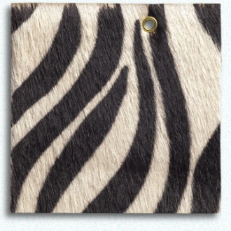
But a little goes a long way. I’m not proposing that EVERY new addition is both black and white. A little zebra goes a long way (and if you’ve been paying attention, you know I loves me some zebra). One black-and-white pattern, like these Ballard Designs Hayden Upholstered Side Tables done C.O.M. with Edelman’s Cavallini Embossed Black and White leather, one black-and-white or gray piece of art, and that’s probably enough of a marriage to make sense of all the rest.
By the way, those tables are a HUGE trend now: applying upholstery to Parson’s and waterfall tables, a well as extending the upholstery all down the leg, like Mitchell Gold + Bob Williams’ brand new-for-spring Trent chair.

Layered and Layered and Layered
Monochromatic, or here, “dichromatic,” really relies on getting the depth you might not be getting out of color with other things, like materials and texture. And layering.
So behind that headboard, and to beef up the bed, I’d get a fabric folding screen back there, like Mitchell Gold + Bob William's Eve Room Divider, flattened against the wall, in an all-black or nearly-black fabric, like Weitzner’s Estuary, in Chestnut. That will start to take some of the thunder away from the white walls, and get one step closer between the envelope and the content, since a screen like that, used in that way, has one foot in both camps: it talks to the room as architecture, it talks to the bed as a upholstered furnishing. It’s also something Brett can take with him when he moves.


Or bring INSTANT layering, with either those Nevelson-inspired Constructionist wall screens (one behind the bed, a pair flanking it) or the Curved side table, both from Weisshouse, one of the best-curated ready-to-wear furnishing outlets around. I could also see those screens behind the dresser, or soldiered up on each side of the window.

Spit and Polish
I love the starting mix Brett has: Soft and sharp, matte and shiny, traditional and not-so. He’s really wise to bring in some shine, super important in all all-dark or nearly all-dark scheme. It’s also, itself, a step between black and white of sorts. So the next steps should also bring in more shine, either with glass, lacquer, chrome or mirror. Or all of the above. The darker the room, the more it benefits from some shine.


Get Your Drape On
Even in a rental, and even with a killer view like Brett has, window treatments are worth the bother. I’d flank the window with panels of West Elm’s Velvet Grommet drapery panels in Iron.
And even though Brett was on the hunt for in-window tension rods, DON’T DO IT. Step AWAY from the windows with tension rods. It will make your window seem smaller, and even expensive drapes will look cheap. Get those rods up and out of the window well... as far across the wall as you can, as close to the ceiling as you can manage. Your window will look bigger (I promise) and you will get far more mileage out of the fabric’s impact. Simple hardware can go up with minimal drilling, and it really makes a difference even if your light and privacy controls are already addressed.
And even though Brett was on the hunt for in-window tension rods, DON’T DO IT. Step AWAY from the windows with tension rods. It will make your window seem smaller, and even expensive drapes will look cheap. Get those rods up and out of the window well... as far across the wall as you can, as close to the ceiling as you can manage. Your window will look bigger (I promise) and you will get far more mileage out of the fabric’s impact. Simple hardware can go up with minimal drilling, and it really makes a difference even if your light and privacy controls are already addressed.
Suddenly, with softening draperies, the bed and the window are speaking to each other (and I think the biggest connection in a bedroom should be between the bed and the window treatments). Plus, a thin black rod or a thick chrome one and you've already started to knit your room elements together.
In the very least, an inside-mount Roman shade, in black. But even then, I'd flank it with panels that match in color, but vary in fabric, like a nubby black linen shade and black velvet or silk drapes. Super swanky.

Lighting
Even if you like a dark room like I do, you’re going to need lighting, and lots of different kinds, especially in a bedroom, über-especially in a DARK bedroom. Lamps (black shades are great in this scheme), indirect, incandescent and halogen all have a place, and a role here, whether you’re sorting your navy and black socks or when you are engaged in, um, other pursuits that require lighting more flattering.
If there’s not room for two nightstands, get a standing floor lamp for the window side of the bed. Get an uplight in a corner. Decide if you read in bed or not, and determine the best kind of bedside lighting (don’t dismiss wall-mount, either) based on what you do in bed. Wait. You know what I mean.
If there’s not room for two nightstands, get a standing floor lamp for the window side of the bed. Get an uplight in a corner. Decide if you read in bed or not, and determine the best kind of bedside lighting (don’t dismiss wall-mount, either) based on what you do in bed. Wait. You know what I mean.

And lighting is ALWAYS a place I encourage the splurge. You can take it with you, and a classic lighting choice will stay with you for years (I’ve had my first Tizio since college).


Mixing it Up, Finishing it Up
When you limit your palette, you can have a LOT of fun with the mix. Geometric and curvy. Found and finessed. And don’t “set up” the casegoods: it's more interesting when the nightstands and the dresser don't match. I'd love to see Weisshouse's BLACK GLASS Chest of Drawers paired with Ballard Designs Small Serpentine Chest, as just one example. If there’s room for two nightstands, I’d do it (and those I don’t mind as a matched pair.) But adding a nightstand doesn’t mean tossing the mirrored stool. Let that sit just in front of a stand that gives you some storage (see “Layered, Layered, and Layered,” above.)

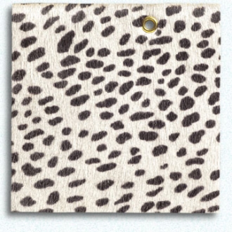
And on finishing up, I'd keep building from what Brett has: Although it needs some reframing love (match the whites, ditch the black bevel, beef up the outside frame... or mirror it), the cheetah print he has works nicely. I'd give it one other reference in the room: A bolster of Edelman's Cavallini Embossed Snow Leopard cowhide with a simple black leather welt would be a sexy, sexy note on the bed. Well, when Brett's not already on it.
So, yes Brett, there’s good news and bad: you can get one step closer to a monochromatic scheme without a total blackout. And without losing your security deposit. And, unlike many things, the answer here IS black and white. Well, mostly.
Which pieces from this batch would you pull together for a sultry, sexy men’s bedroom? What tips made you go HMMM or WTF? Could YOU live in a all-black bedroom? I want to hear from you!!
Which pieces from this batch would you pull together for a sultry, sexy men’s bedroom? What tips made you go HMMM or WTF? Could YOU live in a all-black bedroom? I want to hear from you!!
And head over to Pinterest, where I've pinned all the items shown here (and then some!) so you can recreate the look.


Great post Patrick. Brett might need to print it out and study it. There is a lot of information here. I think he should definitely paint, at least one wall and paint it black or off black. He will likely live in the apartment longer than he thinks and will regret not making it his own. He should also get the black floor lamp.
ReplyDeleteI LOVE that lamp! It's definitely in the splurge range! But a classic.
DeleteThe lamp stands are looking so stylish and modern. Love to have them in my home.
ReplyDeleteHead over to the companion Pinterest board to find all the sources!!
Delete