Wednesday, September 22, 2010

Trendspotting at the NYDC - Color Stories


Color forecasting is a tricky business, and an art all its own. But walking the floors at the New York Design Center this week, a few things are clear, a few directions distinct, and ALL are ready to roll (or brush) out, in upholstered furnishings, casegoods, textiles, accents or even paint, right off the showroom floors into your own home. It's What's New, What's Next, right now.

Parchment and Champagne

Upholstery at Hamilton Furniture

Reeded Console, Barbara Barry Realized by Henredon

Tracy Kendall's "Buttons" Wallcovering, Ted Boerner New York

Don’t call it beige. On almost every floor, in showrooms Hamilton Furniture (sadly, no relation!), Henredon and Ted Boerner, in contemporary, traditional and transitional showrooms, parchment finishes and champagne tones are keeping things chic, fresh and glamorous. A warmer, deeper ivory (with a kiss of pink or yellow) is showing up in upholstery, wallcoverings, and painted and applied finishes on casegoods.

Barely-there Tints

Artwork at the relocated and expanded Dennis Miller Associates showroom

Silk Velvet Upholstery at Saladino Furniture

Pale and ethereal, these are not your grandmother’s Palm Beach pastels. A little grayer, with a little glimmer, they reference the colors of iridescence, but with a grown-up sophistication. Perfect when served with parchment and champagne, and no better way to get your Glam on in the bedroom. The Queen of Barely-there, Barbara Barry, runs with the concept in the room vignettes at Realized by Henredon (well, not runs. Breezes through, elegantly). And the King of Castle Chic, John Saladino, wields these pale tints with a deft hand. I'd pair them with a sun-bleached Oushak, and punch up the scheme with some deeper corals or the orange of the moment, Persimmon.

In-Between Green

Upholstered Sectional at PROFILES

Silk Velvet Upholstery at Saladino Furniture

Somewhere between sage and olive lies a mossy green that’s one part modern, one part retro, but very now. It’s a near-perfect, not-quite-neutral, ideal on larger upholstered pieces. I took a Lichen to pieces at PROFILES and once, again, Saladino.

Off-the-Chart Colors

"Aaron" Chair at Bright

"Ella" Sectional at DESIGNLUSH

Christopher Farr Rug (displayed on the wall) and Leslie Anton's "Blossom" Pendant at Ted Boerner New York

These are the colors that fall between the lines of paint charts and the color wheel. Earthy and interesting but never muddy,they defy description through a hefty dose of gray and (sometimes) a little bit of pewter sheen. The perfect foil to modern leathers and rooms with a settled-in feel. They're the perfect way to add a sense of luxe to mid-century modern, and add warmth and luxe to contemporary spaces.

The New Orange

Elana Lounge Chair in "Poppy" at Bright

Vanessa Side Chair at Bright

Iconic Vladimir Kagan Sofa at Kagan Couture

Orange grows up, and you’ll fall in love. In velvet or mohair, like on the curvaceous sweep of Vladimir Kagan Couture’s classic sofa, this red-orange glows like the embers of a fine cigar. It runs the autumnal spectrum from bright rust to persimmon. You’ll just need a little to bring fireside warmth to a living room. I can also see this becoming the next new-classic color for the formerly-red dining room.

What colors are YOU seeing, loving?

Trendspotting at the NYDC - Style Trends

Prepping for my appearance at the New York Design Center's "What's New, What's Next" Fall Preview event, I took a top-to-bottom tour through the 16 floors of this venerable home furnishings building. The place was buzzing, with showroom and building renovations, new tenants, floor-to-floor moves, new collections, and some noticeable trends worth watching… and taking home. First up: style trends. (PS: Can you tell I'm a John Saladino fan???)

The New Antique

Museum-mount Lighting from Arteriors Home

Museum chic: architectural fragments are being handled and displayed with a carefree ease, a confident ireverance, and paired with sleek mounts and functional form. At Saladino Furniture, a capital commands even more attention (and the modernity of sculpture) when perched atop a sleek stainless cylinder. In Arteriors Home, architectural fragments get a new lease on life, and add new life to lighting. It’s a beautiful way to add patina and the grace of age to even the most modern interior.

Rat Pack Luxe

"Aaron" Chair at Bright Furniture

Maybe it’s the Ad Men factor, but Mid-Century Modern is getting a crazy-cool make-over, and it’s as handsome as John Hamm. And just as desirable to have in holding court in your living room. Straighter lines, more luxurious upholstery choices, and hard-to-describe colors (see the "Color Trend" post for more) take the edge off like vermouth in a Martini, and take Wegner-inspired pieces one step closer to the Jetsons, via the CEO’s office. Yes, please. Lots of examples at Bright in Ted Boerner's always swanky and sartorially-inspired showroom, too.

Modern Leather

"Tipping Point" Chaise by Peter Mann and the Modernist Bed in premium hide at DESIGNLUSH

Leather Side Chair at Saladino Furniture

Forget the “Bachelor sofa,” the oversized recliner, and all the damage the 80’s did to leather’s reputation. This is a horse of a different color. Lighter frames, sleeker silhouettes, and architectural edge give leather (in traditional or contemporary form) a fresh, and highly usable, perspective. And hair-on-hide still provides the perfect accent note which, even when patterned or pieced, Is surprisingly neutral. These examples from DESIGNLUSH and Saladino Furniture show the time-travel capabilities of these timeless New Leather pieces.

Instant Vintage

The William Haines Designs Collection at PROFILES

From a galaxy very, very close, and not so long ago. The silhouettes on these pieces of upholstery and casegoods are familiar… but not. The pieces no doubt inspired by flea market finds (of the Clignancourt variety) and antique finds (of the 1st Dibs pedigree) but showroom ready, and without having to raise your paddle at Sotheby’s. The added bonus: You can get your ideal upholstery choice without having to say “Doh!” when the Antiques Roadshow guy says, “Well, in its original fabric, you’d be sitting on a goldmine.” These pieces add instant depth and maturity to any space, especially new-box construction. See also, “Rat Pack Luxe,” and see it also at Bright, Barbara Barry Realized by Henredon (for a 40's glam vintage take), and Dennis Miller Associates (in their brand new digs!)

Plush Life

Iconic Vladimir Kagan Sofa at Kagan Couture

Familiar forms, with fuzz. Mohairs and velvets (see below) take familiar forms and up the ante. Has the iconic Kagan sofa (a signature piece at the expanded Vladimir Kagan Couture) looked more luxurious than it does in this plush persimmon incarnation? Yowza.

Silk Velvet Upholstery at Saladino Furniture

Nothing says luxe like velvet, and with a touch of viscose or silk, this staple of upholstery looks fresher than ever. A perfect pairing with Instant Vintage. These shimmering velvets age beautifully, and their subtle sheen makes even the largest upholstered piece a tamer scale, since they respond to lighting changes so beautifully. And in barely-there colors, the visual weight often associated with velvet just evaporates.

What style trends are seeing, loving?

Friday, September 17, 2010

"The New Curators."

We interrupt our regularly scheduled design interventions for a bit of self-promotion. I'm HONORED to be appearing as part of the "New Curators" at New York Design Center's "What's New, What's Next" design-a-palooza, Wednesday, September 22nd, 2010.

If you've never been to the NYDC, it's worth the trip. A lot to like, including (but definitely not limited to!) Dennis Miller Associates, PROFILES, Global Views, Saladino Furniture, Kravet, Hamilton Furniture, (sadly, no relation!), Arteriors Home, Tucker Robbins, Vladimir Kagan Couture, Roubini Casa, Ted Boerner, and last but not least, the uber-cool and sexy-swanky DESIGNLUSH showroom, where I'll be from 4:00 to 5:00 pm.
I'm in good company, too... the whole floor will be a blog-jam... with popular interior bloggers setting up temporary camp in all the Fourth Floor showrooms. The other 16 floors will be featuring appearances and talks by the likes of Jamie Drake, Kenneth Wampler of The Alpha Workshops, Celerie Kemble, Newell Turner, and many, MANY more.

Come say hello... and if you bring a picture of a room you're having a challenge with, I'm doing on-the-spot design advice! Sort of like a Tarot reading, but for furniture. Hope to see you there!

Tuesday, September 7, 2010

about striking a balance.

“Our style is beginning to look like ‘hoarder’ instead of cool, stylish and young. My husband studied architecture, and I was a media and fashion student, but you wouldn't know it by looking at our house. There have been so many times I wanted to throw everything out and start over, but that's certainly not the answer. At this point, we're living in a house that doesn't entirely feel like home.”

A husband and a wife... free-flowing fashion, and straight-lined architecture... a suburban home, urban-souled homeowners... traditional and contemporary.... hard and soft... casual and formal... some things that don’t need to be changed, and some things that do, but (for now) can’t.

So you how do you strike a balance among all these opposites, without starting from scratch?

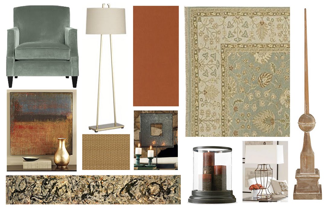
Clockwise, upper left: Martine Chair, Perry Floor Lamp,
Crate and Barrel; Russet Chenille Drapery Panel, Smith + Noble; Devika Sky Rug, Crate & Barrel; Wooden Finial, Baluster Outline Lamp, Wisteria; Bronze Hurricane Lamp, Pottery Barn; Jackson Pollack "No 10, 1949" Allposters.com; Canvas Artwork, Linden Street, J.C.Penney (discontinued); Natural Woven Shade (swatch), Smith + Noble; Decorative Slate Square, Wisteria (discontinued)


Soften it Up While the leather sofa, love seat, and chair, and big stone fireplace push the pendulum to Fred Flintstone, the room needs a little more Wilma: curves, softness, and a little animated femininity. Window treatments (simple panels of a russet-y chenille from Smith + Noble over natural woven shades), and a pair of stone-blue velvet armchairs from Crate & Barrel, will help soften this room like butter in the sun.


Goliath, Meet David Just because there’s a LOT of brown leather in here, it doesn’t mean you have to bring in an equal amount of something else to outweigh it. There simply isn’t room (in the space or the budget) to do that. But a little bit of something different can go a long way. Here, I’d bring in those two smaller-scaled side chairs to replace the one leather armchair (which can find new life in another room). Being the lone notes of color and curve, these ladies stand up beautifully to those blocky brawny boys in their shiny leather jackets.

Celebrate the Givens If you can’t change the radio station, dance to what’s playing. In this case, that fireplace is commanding (in size, position and color). It’s big, it’s pink-ish, but can’t be changed now. By picking accents that pull more from the terra cottas and less from the paler pinks, the stone’s color starts to become more inspirational. Bouncing earthy accents around the room (a decorative slate square, bleached wood finial, natural woven blinds) makes that elemental stone look less like the only outdoorsman at the dinner party.

By shifting the furniture plan to pull more weight away from the fireplace, its role is downplayed. By bringing in the dining room’s sideboard (perfectly proportioned for the large TV, you also bring in a piece with a heft that holds its own against that stony surround. Its gridded front also relates to the stacked stone of the fireplace (repetition makes just about anything seem intentional), and the introduction of this second focal point also helps steal the hearth’s considerable thunder.

Off the Edges While they’re blessed with a large room, the need for circulation through the space is vexing. Pull the main seating in a little tighter, and you help define what’s seating and what’s circulation. It also makes a better conversation area, since no one’s shouting across the room’s full length or width any more. And anyone sitting on the sofa or loveseat can then reach the coffee table… score!

Urban but Earthy To reflect the couple’s urban hankerings, I love subtle city and architectural references, but run through a “little bit country” filter. Here, that means shapes that reference geometry and architecture, rendered in weathered wood or rusted metals.

Baluster Outline Lamp, Wisteria

It also means artwork by, or inspired by, New York urbanists Pollack and Rothko, but in earthy palettes inspired by nature.

Jackson Pollack "No 10, 1949" Allposters.com

Casually… Formal Both husband and wife have old-world roots and soul, but don’t want to feel like they are living in an antique store. Introducing the more modern silver painted sideboard, natural woven shades, and a slightly more informal rug to their antique-inspired coffee table keeps the stuffy out of the space. It also ends up giving the room a collected look. Just not in that scary hoarding way.

Your turn! What should this lovely young couple do to make this room work, fireplace, leather, and all?

Tuesday, August 31, 2010

...about a beige bedroom.

Agnes asks, “I have done every room in my house but when it came to my bedroom I failed... I have no idea what to do. I bought this dresser that I absolutely love (the shelf above the dresser is being removed), had a headboard custom made, bought this mirror… but I don't know how to put it together. I definitely would like to buy new bedding (I hate matching bedding). I'm stuck with the color of the headboard. I love the color by itself I just don't know what other colors to use along with it. And last but not the least important, window treatment. I have these dark chocolate drapes because I have a lot of light coming in the room in the morning. It really doesn't matter if they stay or go. I also got a pair of pale beige lamps that I'm planning to keep. How can I pull it all together?”


Oh, and like so many, Agnes is a renter and her landlord says paint is off limits. Doh!


Agnes, you’ve certainly not failed! You’re on the right track: your big pieces are in place and they’ve got long lives ahead of them (the best way to select your biggest pieces). Your transitional furniture choices can go more modern or traditional, depending on how you push the rest of the room. I am a BIG fan of upholstered headboards, especially in a small room, and yours is a great neutral. Ditto, your classic bedside lamps.
Just a few changes, and a few finishing touches, and you’ll have a room you won’t want to leave.

While some might think the tan headboard and cream lamps are just timid first choices, I think they are THE perfect starting point for an elegant tone-on-tone bedroom that looks WAY more expensive than it will be to pull together. I LOVE monochromatic bedrooms. They’re calming, easy on the eye, and just a nice place to start and end the day. So I love the idea of taking those neutrals and running.

Clockwise from upper left: "Patch" Cowhide Rug, DWR; Metal Rod and Cylinder Finial Drapery Hardware, West Elm; Eileen Fisher Home for Garnet Hill; Cowhide Rug, DWR; Mosaic Abstract Canvas, Ballard Designs; Linen Drapery Panel (Swatch), The Shade Store and West Elm; Lexington Quilt and Shams in Pearl and Palomino, West Elm.
The key to a successful monochromatic scheme is texture. Shiny and matte, rough and smooth… texture gives your eye something to do, without wearing it out. Here, it means silks, linens, cottons and (if not offensive to your personal sensibilities) a hide rug, even over carpet.
Eileen Fisher Home for Garnet Hill


But don’t think that a monochromatic approach equates to matchy-matchy. By mixing the tones (and fabrics) of comforter, sheets and Euro square, you’ll end up with something interesting but still dreamy, like the Eileen Fisher for Garnet Hill bed ensemble.
The second way to make a limited palette work is to run the color range from dark to light, which you already have going. Just fill in the in-betweens, with ivories, creams, tans, and (gasp!) even beige, all the way up to the deep camel-y tan of your headboard.

And the final step to a gradated monochromatic scheme is to have at least two key pieces that encompass a hefty part of your limited range. Here, that would be the capiz-inspired canvas from Ballard Designs, and the Patch Cowhide rug from DWR (or a simple hide, which, on its own, has a beautiful range of ivories, creams and tans… but again, only if your own personal sensibilities support a hide or leather item).


"Patch" Cowhide Rug from DWR

The biggest change I’d make would be to switch out those drapes (and the dark hardware). Their contrast to the walls is just putting the brakes on that wall when your eye wants to wander. In most of my bedrooms, I love to match the color of the drapes to the headboard (or the bedskirt, if you don’t have an upholstered headboard.) It gives the room a strong color base, and that’s what I’d do here. And I know you need light control, but window treatments don’t have to be dark to block light. They just need to be heavy weight, or have blackout lining. And change the hardware to brushed nickel, to repeat the metals on your lamps and dresser (and even the TV!).

I generally don’t love a mirror the end of a bed, and some feng shui practitioners advise against it (the potential to be startled by your image upon waking is behind the principle.) so I’d place the mirror between the windows, if it works, size-wise.


Mosaic Abstract by Mona E. for Ballard Designs

It looks like you have room for something at the end of the bed, or on that wall… but if not, use the wall at the end of the bed for something you want to look at from bed… a large piece of calm but interesting art, like the piece from Ballard Designs, which also mimics your grid-tufting on the headboard.
Finally, when you do away with the over-dresser shelving, consider taking your TV off the wall, and having it stand on its own on the dresser. You’re giving a LOT of presence to the TV where it is, and it’s keeping you from using that wall for far prettier pursuits!
Okay... your turn! How would you take Agnes' starting points, and finish this room up without picking up a paintbrush, or changing out her main pieces?