Friday, January 29, 2016

...about sailing into Design on a Dime 2016: what’s in a theme?

It’s that time of year again, where I make the rounds, (large) hat in hand, looking to curate a selection of generously donated goods for Design on a Dime, the annual (and now, TWO city) charity fundraiser to benefit Housing Works.

A big part of the fun, aside from helping break, then smash and surpass the $1 million mark of funds raised, is the pure folly of designing without practical parameters beyond sale-ability: everything we solicit is meant to be sold off, at 50 to 70% off retail value (hence, the “on a dime” part).

It’s the perfect storm of showmanship, a charity for a cause I truly believe in, a real bonding experience with designers with whom I’ve become fast friends, a group of staff and volunteers that feel like family each time I return, and one of the most fun, exhilarating and bargain-riddled parties of the year here in Manhattan. Plus, and no offense to my lovely clients, it’s super fun to design without yuze guys. So, yeah, I’m in it for my sixth consecutive year.

But where will I go with the design this year? I have ample rooms-without-a-home floating around in my head (pretty sure most/all designers do), but they were all fuzzy mirages, still developing like a photo print in a chemical bath. What would it take to snap something into focus, and give me a direction and filter through which to run all my wish lists, asks, and ideas?

In years past, I started with the walls... every year except for last, I’ve been able to start with an amazing wall covering, twice from my friends at Koroseal, once from Schumacher. In 2013, in a post-Holiday House haze when the January DOAD invite arrived, I thought, “If The Shade Store says yes to their white string panels, I’ll do DOAD again.” They did, and so did I.

And each year, close on the heels of the wallcovering, there’s been art: Babette Herschberger’s simply-not-so-simple color field square the first year, a giant parakeet courtesy Australian artist Leila Jeffreys a little later, and Drew Dogget's traffic stopper last year. They all kicked off the color palettes and vibe for the three-walled room in a way I wish more people would build rooms: from a great piece of art, out.

In 2013, Dan Romer’s “Lord Ricky” image sent me down a wickedly wonderful path, part Game of Thrones, part male Maleficent ... and, against those shimmering, shifting Drag Race-y, fringe walls, "Wicked Queen" was born.

You’ve heard me (and New York Spaces) sing the praises of Dan Romer once, twice or thrice before. I’ve been tremendously motivated by his exceptional use of color in past Design on a Dime installations, where he has been uber-generous to me every year since I first tracked him down, and his work enlivened both my Modern St. Patrick’s Day and Derby Deconstructed rooms for Holiday House.

A few years back, I was lucky enough to see a room full of Romers, at the Leslie Lohman Basement Annex, where Dan co-starred in a two-man show with also-stellar colorist, anatomy-draftsman and RISD grad Chuck Nitzberg. It was the very first time I’d seen Dan’s work en masse, if you don’t count the impromptu donation/loaner selection meetings, when colorful portraits, swarthy gents with bedroom eyes, and rippling nudes spilled from his portfolio like gemstones from a jeweler’s bag.

At that show, I first met Dan’s “Rocky Seas,” the angle-eyed sailor man, and it was love at first sight. While racking my brain for some divine Design on a Dime inspiration, my mind kept wandering back to Rocky. A Facebook PM to Dan got a quick confirmation that a custom print of Rocky would be mine (fingers crossed my friends at Steven Amedee Custom Framing will once again do a Romer piece full justice...)

But where to go from there? Well, the process unfolds pretty much like it does when designing any room around one given piece, art, rug, sofa or heirloom... although we're limited to what vendors will donate, or generous friends will purchase to donate off my annual Design on a Dime Donation Registry. I’ll be sharing more of the process a little later.

In the meantime, in our hashtagged, screen-named and abbreviated world, I love giving these ethereal vignettes (buyers at the opening night gala pretty much loot the place beyond recognition) a permanent but short-handed (and hopefully, memorable!) name... the aforementioned Wicked Queen, last year’s Adventurer’s Lair cases in point. And while “Rocky Seas” is the perfect title for the inspiration piece, it seems to tempt the fates just a bit in an event that needs to run as smoothly as humanly possible, both during the months of prep and the implausibly short two-day set up.

So, good gents, lovely lasses and the happily uncategorized, I’m proud to reveal this year’s theme: “Hey, sailor!”. Following the lead of Dan’s hot seaman with the rakish sailor’s hat, the theme sets the tone for a cheeky, nautical-and-naughty but nice, beachy room, that allows me to interpret a theme ripe with possibility, while steering clear of the usual pitfalls of theme-y decorating. Plus: So. Many. Puns.

And so much inspiration: aside from Dan's always-inspirational but previously-unconsidered color palette, the oceanic theme inspires a world of its own: navy blue (doing a navy blue room has long been on my personal wish list) ship-shape brass, lots of “intentional white,” and earthy, rope-y textures. Part yacht club-clubby, part yacht-modern. Inspired by my Miami and Mangrove roots, an homage to the interiors of Allison Spear and the sexy vibe of Querelle. A little Mr. Roberts, a little Village People. And a lot sexy cruise-y. Can. Not. WAIT.

But Dan and Rocky don't get all the theme cred: my wondrous friends at Currey & Company (have you ever met the force of nature that is Bethanne Matari??) said yes to donating a shell-encrusted, sailor's Valentine of a piece that meant, this year, the heavens were aligned to bring to life a theme that's been stuck in my head like a schooner in a bottle for more than a few years now. 
The theme is also very much in synch with some other amazing new-season pieces already committed to by amazingly generous donors Bernhardt and Mitchell Gold + Bob Williams. Plus, I’m DEEEELIGHTED to announce that my amazing friends at Jayson Home are on board with donations, after two years of doing their very own booth for DOAD. I wish Wisteria would come back on board, too, since some of their amazing range of home accessories are also perfect. Maybe next year.  

DOAD NYC 2016, anchors, away!

So, come aboard Design on a Dime 2016, and get ready to meet Hey, Sailor! We’re expecting you.

Any predictions of what will give this room a healthy dash of sea salt? I'd love to hear from you, here and on Twitter. Use the hashtag #heysailor when you do!

Sunday, January 3, 2016

...yours, mine and ours: top 10 design highlights (and one industry lowlight) of 2015.

 
2015: it was, once again and thankfully, to quote Frank Sinatra (well, Ervin Drake, actually, giving credit where credit is due. More on that later), a very good year: for me, for shelter magazines, for design-related charities, for special events and smart marketers, for two very talented and lucky designers, and for the interior design profession and community in all. Well, mostly good. But we’ll also get to that later.

Here’s my unofficial list of why I thought 2015 was a banner year, showing that the recovery of the interior design world is moving in all the right directions, in all kinds of exciting ways.
1) Benjamin Moore Color of the Year  
With much fanfare, color-coordinated food, and one of the most elaborately orchestrated, choreographed, handsomely cater-waitered parties of 2015 even by Manhattan standards, Benjamin Moore entered the Color of the Year space formerly dominated by color think-tank Pantone.

Pantone’s past choices always seemed to create much hue and cry with the interior design community, the ruddy, clay-colored Marsala falling the flattest in recent years, even though their selections did indeed eventually find their way into the palettes and mood boards of many a designer (as did their choice of Emerald in 2013, a color featured in my own Modern St. Patrick’s Day maiden voyage at Holiday House that very same year).
While Sherwin Williams beat Benjamin Moore to the painterly punch with an annual selection of their own by a few years, Benjamin Moore reclaimed the space from both Pantone and Sherwin Williams, and not because of the party, but through a surprisingly savvy move and bold selection. Their colorful, audacious entry into the race? The ultimate chameleon, the most neutral of all colors, an established decorator go-to, and their very best seller: Simply White. 

Why was Simply White so, well, simply smart? It was Benjamin Moore’s way of resetting the clocks, cleansing the palette, and saying, hey, we might be late to the game, but it’s always been our playing field, so the rest of you can take your fan decks and swatch books and just go back home. It got tongues wagging, got the “Is white even a color?” debate re-raging, and most importantly, people talking about color, with Benjamin-Moore’s name squarely attached. Even Pantone’s attempt to broaden their own COTY audience by serving up a duet of nearly-pastel colors this year (a blue and a pink) paled in comparison. 
Benjamin Moore also supported the launch and the choice with a companion palette that highlighted Simply White as the ultimate team player. I can’t wait to see how they follow it up and launch it next year, no small feat when it seemed the excitement about an annual color announcement was beginning to wane. In all, simply brilliant.

But I’m sill waiting for the quirky UK paint purveyor Farrow and Ball to jump in, since I’d love to hear that Mouse’s Back, Dead Salmon or Mole’s Breath was the tint of the moment.
2) Design on a Dime  
Another record-breaking year for the annual designer-curated discounted shopping fundraiser to benefit Housing Works Thrifts, as the tally continues to climb northward of the million dollar mark, and the event branches southward, to their first-ever Miami incarnation of the Manhattan social and shopping staple (the Miami version just weeks away, February 5-7, 2016).
I went all Small Dark and Handsome for DOAD 2015, and my usual vendors stepped up once again, with anything-but usual donations... custom and COM versions and more-than-the-year-prior quantities, plus new vendors, including photographer Drew Doggett, whose traffic-stopper image anchored and inspired the entire vignette. 
It was my favorite space to date for DOAD, and also just one of my own favorite spaces, period... and it’s inspired me to think even bigger for Design on a Dime 2016 (can you say “double wide”?)... stay tuned!
3) Editor at Large
Lights! Camera! Action! While I’ve had the great fortune of talking to the folks of Editor TV  quite a few times on camera (discussing Baker furniture, Welspun, Benjamin Moore, Bilotta, Holiday House, Avery Boardman and Zoffany), this year allowed me the great fortune of turning the tables, and, mic in hand, do the Q-ing to all the As.

I followed in the well-heeled footsteps of long-time industry expert Marisa Marcantonio, Traditional Home’s ever-radiant Tori Mellott, and one of my favorite hosts and moderators Sophie Donelson, who all have and continue to hold court for Editor TV, the video offshoot of Editor at Large, the go-to source for design event coverage and industry news.

But this wasn’t just any ETV video... this was the official coverage of the doyenne of show houses, Kips Bay, a two-parter where I had the honor and pleasure of talking with room designers Jamie Drake, Anne and Suysel, the lovely ladies of Tilton Fenwick, the stylish and Kathleen Turner-evoking Alessandra Branca, Thom Filicia and more. (See the results, here and here.)

As I suspected they would, Editor TV’s director/producer (and patient coach!) Julia Noran and videographer Kevin Malone kept me cool along the way and looking good in final edits. It was a gig I was highly honored to have, and one I hope I get to repeat in 2016.
 
4) Sophie Donelson at House Beautiful 
To know her is to love her. That’s the most basic of many reasons the design community (at least in New York) let out a collective woot when it was announced that Sophie Donelson was next in line to helm House Beautiful.
A twinkling but wicked sense of humor, down-to-earth demeanor, and marketing and media savvy are all hallmarks of the newest editor, taking the reins from Newell Turner, who stepped up (becoming Hearst Design Group’s overarching Editor) not down, to allow Sophie the honor of running HB, and giving two of the business’ most favored folks two of its top spots.

She’s already given the already-fresh shelter title a breath of fresher air, social smarts and cross-media coverage, including an appearance on NBC’s Today Show.

No doubt working mom Sophie will be bringing an even more approachable style to the title without losing any of the breezy American chic the publication— and Sophie— are already famous for.
5) Tabletop Market and NY Spaces  
It takes a lot to get this night owl up and out to a breakfast meeting, but three things did just that this year: a host, a location, and an event. And all three were wrapped up in one, as New York Spaces Publisher Lisa Benisvy Freiman extended a special invitation to kick off Designer Day at the venerable table top treasure trove 41 Madison and their designer breakfast, replete with a birds-eye view of a sunlit Manhattan.
It was a lovely introduction to a lovely woman and the great day of walking the showrooms. And, super DUPER bonus, it landed me and designer friend John Douglas Eason at the very top of the publisher’s page of New York Spaces. Great placement, high honor, and the start of what I hope continues to be a great relationship.
 
6) Bilotta Art of the Table
It’s a testament to the power of interior design and smart styling choices to reinvent a space: the Bilotta Kitchen annual Art of the Table. The task at hand? Take the established kitchen vignettes of Bilotta’s showroom in the Architect’s and Designers Building and prop and style the kitchen walls, cabinets, countertops, and tabletops to refresh and redefine the built-in choices. For the same reason I love Holiday House being in the same mansion every year, reinvented by our tricks of the trade, I love this Bilotta event, so I was overjoyed when media sponsor Traditional Home came a-calling, inviting me in for this fifth year of the event.

I had big Gucci loafers to fill, with the likes of table-top-dog Michael Tavano, stylish Darrin Varden, dining table diva Tamara Stephens, and Robert Passal, whose table at DIFFA for the New York Times at Dining by Design was an elaborate, immersive tour de force, all setting the tables, and the stage, before me. Yeah, no, no pressure.
This year, official tabletop donor Prouna (part of the Kiyasa Group) helped us get our bling on, and some of my very favorite sources (Berry Campbell Gallery, John Lyle, Thibaut, Arteriors Home, Fivestripes, Dransfield Ross, Jayson Home and more) helped me use art, vibrant color and natural texture to create a luxe and layered kitchen where art was the star, some unlikely color did the heavy lifting, and the finely feathered birds on Prouna’s Pavo SIlver pattern came to life and inspired a modern autumn room. There’s more to the story here, and it was a feather I was most happy to put in my own cap.
7) Drake Anderson 
Mother of Dragons, it was an announcement of epic proportion, as if two houses on Game of Thrones joined forces (sans the previous rivalry, bloodshed, bodice-ripping, or poison-wined wedding, one would hope and assume): the news that color maestro Jamie Drake was joining forces with wonder kid Caleb Anderson, creating Drake Anderson Design, an almost unprecedented alignment of two wildly popular, bold-faced firms already enjoying significant success, all of a potential Parish Hadley historic significance.

Caleb worked for Jamie in the past, and his classic, eclectic and sculptural stylings paired with Jamie’s more modern, art-driven vibe will most certainly create interiors worthy of the record books. 
8) Traditional Home and Holiday House  
Two for two! In a “very special cross-over event” between 2014 and 2015, my second appearance in the halls of Holiday House in 2014 yielded a second appearance on the pages of Traditional Home in 2015. I was thrilled that the Derby Deconstructed room saw the light of another day long after its dismantling, and entered the archives of Traditional Home. I could not have been more pleased with Peter Rymwid’s photo, putting the “Pother” portrait by Aaron Smith, upholstered chimney breast by The Workroom, brilliant rose-colored Bernhardt chairs and custom settee by Avery Boardman, all so elegantly cloaked in JAB Anstoetz textiles, Wisteria coffee table, luscious 100% silk carpet by Carini Lang, and Derby-hat evocative “Egret” fixture by ABYU’s Steven Wine all front and center.

It helped get me over sitting out the 2015 Holiday House, in a year that saw the welcome introduction of Marks & Frantz and White Webb, and the return of veterans James Rixner and Vicente Wolf to the Academy Mansion, where I hope to once again roam the stone halls and paneled rooms (universe, and Iris Dankner, if you’re listening...).
9) Met Home, Resurrected 
It’s where I first learned about Post Modernism, Alessi, Michael Graves, Niedermaier,  Merchant Ivory and more... Metropolitan Home, the shelter publication that taught us all that size parameters and apartment living were no barriers to high style. Met Home was one of the surprising casualties of the recession that took out its fair share of titles in the wake of a bleak 2008.

Hearst Design Group Editor-in-Chief Newell Turner made the official announcement of its return, a welcome one when just a few years ago, it seemed more print publications were shuttering than unfolding.

The announcement gave me yet another title to aspire to, with either words or images, in the coming years, and I eagerly await its spring/summer pilot issue in spring 2016. 
10) Custom, Bespoke, and Giving Back
Pret-a-porter got a little more haute couture in a year that saw a wonderful increase in the caliber of client, and a continued trend toward clients wanting one-of-a kind items that only a designer can help deliver.

In 2015, I was most pleased to be able to patronize Warp & Weft, Edward Ferrell + Lewis Mittman, Shivhon Custom Carpets (their custom-colored "Ryu" rug, above), DESIGNLUSH, Marks & Tavano, Mortise & Tenon, and Anthony Lawrence Belfair, to name a few, either for the first time, or just more frequently.

Even Mitchell Gold + Bob Williams and Crate & Barrel got in on the bespoke action, as I took advantage of their Customer's Own Material programs and decked out their frames in designer duds from Duralee, Robert Allen, Donghia, JAB Anstoetz and even custom-colored Quadrille fabrics.

With these introductions, rooms get even more personal, special, and unique, in ways that add real value to not only the pieces, but to the process, as well.

I was also extremely pleased to place more and more orders with Bernhardt, Circa Lighting, Lamps Plus, Mitchell Gold + Bob Williams, JAB Anstoetz, and Room & Board, given their past generosity with me over my five years of participating with Design on a Dime and two years of Holiday House. I’ve always remained fiercely loyal to vendors who’ve said yes when I’ve come knocking, and 2015 allowed me to place a real dollar value on the grateful pay-back.

...and One Lowlight  
The one lowlight is a cautionary tale of sorts, with a backdrop of imagery gone rogue through Pinterest, Houzz, Facebook, Tumblr and Instagram: a noted and visible New York City interior designer was revealed to be using the work of nine-plus other interior designers with whom he had no professional connection, to build his own portfolio. Bad enough, but he was also using these images for contest submissions, reputable national Top Twenty rosters and entrée into otherwise-vetted (and high-profile) events around town, where his name was a fixture and his presence a given. Sadly, these misappropriations also karmically undid his charitable work for DIFFA and other great causes for which he helped generate substantial buzz and cash.

I note this not for the scandalous nature of the news, but to call attention to how fast and loose the universe of imagery, credit and image rights has become, in a world where we’re all one cut-and-paste away from plagiarism, and even the well-intended Pinner can’t find his or her way back to the original source of the image, not to mention the work's actual designer. It’s easy enough to be accidentally inconsiderate, let alone what’s afforded when your intentions are less than pure.

But companies are doing it too... designer’s images show up in Houzz ads, and not even images which first appeared on its virtual pages. One designer’s quote from a meme on the wildly-followed IDC Instagram page is randomly paired with another designer’s image on an otherwise reputable site. Tile vendor Walker Zanger regularly uses uncredited designer images in their Facebook posts, where they pair product with tile imagery in a reverse-engineered mood-boardy sort of way.

While the idea of pulling in borrowed images— what we used to call “swipe art” for client pitches back in my ad agency days— is nothing new, in social media it’s either something we should now either collectively call out or just get comfortable with, since it will continue to happen more, not less. It all basically starts with “credit where credit is due,” and the golden rule of “do unto others,” or expect the same thing in return. I’m sure if a designer’s work featuring a company's tile was published in a national magazine, they’d expect credit, and it seems like exceedingly bad judgment to shoot the feet of the very community to which you’re hawking your wares.
These sketchy incidents and Milli-Vanilli moments point out that there are still huge gray areas in what we allow, and what we think we are allowing when we’re actually signing away our rights on a website or app with a quick click of 14 pages of disclaimers. Of course, gray areas should never be used as an excuse for plagiarism and blatant misrepresentation. And you have to have ethics to use them.
Perhaps we've forgotten the "media" part of "social media," and in doing so, also lost sight of the rules we previously applied about usage, credit and (god forbid) royalties. Maybe it's time for some new rules.

The lesson? Watermark your images, and/or just resign yourself to the fact that nothing, anywhere any more, is private, regardless of settings.

But let’s not end on a lowlight. I’d like to point out that all the other items on the list were made possible by vendors, craftsmen, to-the-trade design buildings like my friends at the D&D Building, PR firms, magazine editors and publishers and their creative sales departments, charitable organizations and colleagues doing wonderful things, and clients who make those wonderful things possible. So, the real highlight of 2015, as I hope it to be again in 2016, is sheer gratitude.

What was your design highlight of last year? And what are you looking forward to in 2016? I’d love to hear from you.

Wednesday, October 28, 2015

...about making the mix modern: Bilotta Art of the Table.

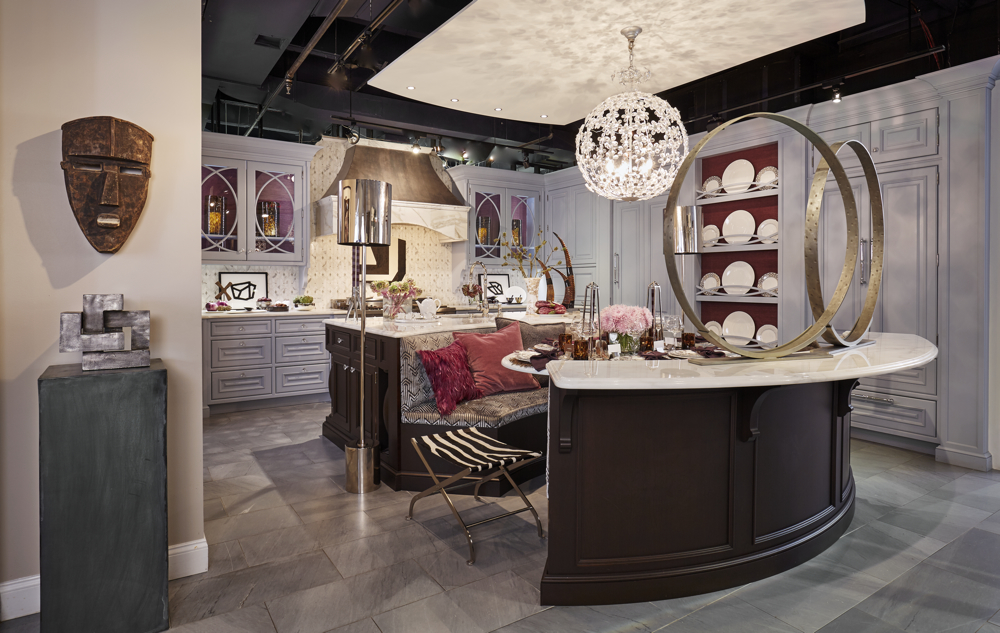
Picture it: a beautifully-blank slate of cool marble countertops, raised-paneled cabinets, dark wood, and pearly, slate-y-gray floors. That was my fortunate starting point when I was invited to the fifth annual Art of the Table at the New York Bilotta Kitchens’ showroom, one of five designers each assigned one of the permanent kitchen displays, each more gorgeous than the next even empty.

We were each tasked with bringing our own stylistic twists and turns to the spaces, with table top choices, art, and accessories. We couldn’t make any structural changes (basically, anything already built-in had to stay that way), so it all depended on what we had borrowed, bought, trucked in, hung up, propped, arranged, set or leaned to tell a compelling, if not somewhat fantasy-based story, helping visitors see the kitchens in a whole new light. Basically a styling assignment, but not unlike working within the confines of bringing a room to life in a rental, or working with a client itching for change yet not yet ready, willing or able to renovate.
 
The other major given, too, was the table setting: event co-sponsor Prouna, a purveyor of luxury stemware, flatware, and fine bone china, much of it encrusted with a glittering scatter of Swarovski crystals (yes, you can eat off them... just hand-wash, please!). Several patterns seemed perfectly matched to this kitchen of icy, silvery and pewter tones, some even cut of the same fine cloth as the kitchen’s pre-existing chandelier, an exuberant orb of crystalline flowers (Prouna’s Platinum Leaves pattern, an early front runner, seemed made for this kitchen, and that light.)

All great news, right? Well, yes and yes-ish. These, as they say, are all good problems to have.

The kitchen I was given was by far the most traditional within the sleek Bilotta space, and that’s not necessarily where I would start, even though I really haven’t met a style I didn’t like (and I’ve done my own traditional kitchens before without issue, with a few more in the pipeline). The amazing array of Prouna’s pieces and patterns from which to choose is also far more fanciful than I might consider left to my own more modern and minimal devices. But I also love a challenge, the attraction of opposites, and the game of “compare and contrast,” so I knew, right away, these traditional (and, with elegant curves and a floral chandelier) somewhat feminine beautiful bones would be getting some modern, masculine elements to create the good kind of tension from which any room, fictional or family-friendly, benefits.

Starting point: The original Bilotta kitchen
Color Story, Part 1... and the “Divide by Two” Rule
The first task to tackle was making my mark on the space itself, and for that, I turned to my favorite tool in the toolbox: color. I knew this blue-ish gray, white and brown kitchen would play well with almost any kind of palette. But when I’m working with givens, I like to knit in rather than purely layer on. So I came up with a plan that’s proven to make sense even outside this kitchen: when faced with an existing color to add, work with or around, see what happens when you break the main existing color into its two biggest parts... so in this case, the predominately gray background was broken into its two parts: black and white (a purple room could be split into red and blue, as one example, a beige room broken into deep brown and pure white, another).

When both black and white are used intentionally, I think the effect can be strong, graphic and gutsy. I also knew bringing more white into the kitchen would make the marble countertops and white tabletop seem like intentional choices of my own, not just a bit of lucky and rich inheritance. (I’m a fan of what I like to call “intentional white.” See how here and here, and stay tuned for more!)

Start (Again!) With Art
With black and white as my first decision, the next one was exactly how to bring it. I decided to take the “art” part of the “Art of the Table” assignment very seriously, and start where I often do, especially when no client is on board: with art. Off to see Christine Berry of Berry Campbell gallery I went, and she graciously let me raid the ample and inspiring storehouses of their recently and gorgeously expanded Chelsea gallery.

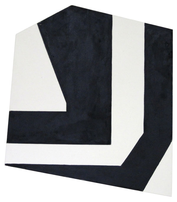
Immediately, Ken Greenleaf’s shaped canvases (non-rectilinear art a current and ongoing obsession, sure to pick up more fans when the Frank Stella show comes to town later this year) and Ken’s small-but-super-strong charcoal drawings felt like they’d provide great contrast to the finer lines and sweeping arcs of the surrounding cabinetry. 

Done, and done, and the gracious Christine didn’t bat an eye when I revealed I’d be hanging the main canvas above the stove, arguably the kitchen’s focal point, although not the most traditional of places to hang a museum quality piece! Ah, the fun of a fantasy installation, but in all seriousness, not every gorgeous Manhattan kitchen always gets cooked in, so not that far in the realm of folly. 

To add to the art story, metal sculptures (another current obsession), deceivingly high-end in appearance, but in reality, from the go-to treasure troves of Arteriors Home.

The metal rings, a pair of their Kobe sculptures, created a giant graphic room divider on the kitchen’s elegant curve of counter-height seating that suggested enclosure without shutting off the space, while echoing, in a more industrial way, the cabinets’ interlocking arcs.

Suddenly, a narrative framework emerged, one of an art-driven modernist who’d inherited a classic kitchen (maybe in a great Brooklyn brownstone), and other decisions started to fall into place.
Color Story, Part 2
While the framework was coming into focus, I started to narrow down the china choices. While the Hemisphere pattern caught my eye early, I also kept coming back to the Pavo Silver, and what turned out, at first, to be the sticking points for that choice— an overall, nearly-Baroque, no-holds-barred pattern and its purplish, lavender wash, both of which seemed distinctively NOT very “modernist” or (and please pardon the gender assumptions) masculine— ended up being wonderful palette inspiration. Hey, even a minimalist is allowed to get his bling on and set a fancy table every now and then, and we’re entering the season of bounty where fancy tables anchor family gathering and professional fetes... so why not let my fictional modernist in on the fun? Plus, “fancy” is what Prouna does best. 

That lavender wash (and a deeper, richer purple rim on the bread and butter and salad plates) made me realize that the range of purples, from aubergine to amethyst, lavender to mauve, would be a perfect yet unexpected color choice... what could be more modern than that?
The heroically scaled Fiercely Remote, by Perle Fine, courtesy Berry Campbell, was tucked into the Butler's pantry, and provided more color reinforcement, knitting together the room's range of purples.

Amplifying What’s There 
I do also very much like “bouncing the bones” of a room further into it. Otherwise, you end with two pieces, and a split-personality, two awkward party guests with nothing in common to discuss. I still had two components that needed bouncing to knit content and shell: those purples from the tabletop, and the deep espresso base to the kitchen island, table and the closing curve of the cozy banquette.
 
To get purple into the room, I turned to my friends at Thibaut: their Shang Extra Fine grasscloth in Plum lined the plate display area and the inside the glass-fronted cabinets (the second time I used the aptly-named Extra Fine paper, that reads more like silk than grass).
 

To get the room’s brown further integrated into the add-on layer, I turned to accessories, layering on great African pieces (that echoed the Greenleaf angles) courtesy Bruce Tilley’s Décor NYC, and tortoiseshell, from my own collection and from Pottery Barn, votives used as water glasses, and hurricanes used in the cabinets.
Falling for Fall 
I’m a self-professed sucker for fall. So once pheasants appeared on the Pavo plates, I helplessly fell for fall: this would be a decidedly autumn table. But can you create autumn in an ice-toned room more suited for a Doctor Zhivago, totally-Frozen fantasy? I say yes! Like bringing the cozy autumn aesthetic to a modern space, there are ways to bring a seasonal vibe with nary a pumpkin or pilgrim in sight. 
The amazing pheasant-feather placemats from my friends at Jayson Home, their feathers a real-life relative to the ones on the fanciful plates, layered the table with a scatter of color like a base of autumn leaves, their circles a perfect “bounce” of the circles already ringing the space. More pieces from Jayson Home, in horn and petrified wood, added more autumn and bounced those browns deeper into the space.

Stay Open to Inspiration
Even a strict and solid design plan benefits from an open eye. In the midst of planning, with most pieces in play, some yet-to-be determined, I clicked on an email from Daniel Cooney Fine Art, heralding one of their frequent online iGavel auctions. The image that greeted me stopped me in my tracks and quickened my pulse: Greg Endries’ “Dimitry,” an edgy (I don’t always love that word, but sometimes it truly fits!) image stared back at me from my email. 
The mix of the earthy background, the surprising elegance and modern-baroque of the all-over tattoo, the chic tone-on-tone Louis Vuitton scarf and black leather jacket... even the touch of purple at the lips and coppery-brown sweep of hair... spoke to everything I was hoping this room would be, both color- and vibe-wise. That all-over pattern of his facial tattoo also found a surprising counterpoint to the pattern of the china, a modern Baroque motif that created the room’s “New Kind of Elegant” title.
Suddenly, I found the masculine muse this room needed, and whether the subject was the fictional owner or one of his collected works, I knew he needed to hold pride of place (Greg graciously agreed, and Steven Amedee Fine Custom Framing came to the last-minute rescue).

It proves that ANY interior scheme is an organic process, subject to midstream twists and turns, and this late arrival crystallized all other choices.
Tricking the Traditional 
Along the way, I also leaned on some other tricks to take any possible fussiness out of a traditional scheme, while still being inspired by it: an organic layer, a mix of high and low, shape and scale, and repeated geometry. 
What holds its own against the finely crafted man-made? Organic elements— rock crystal, horn, petrified wood, the stunning feathered pillows courtesy Dransfield & Ross, even the styling choices of eggplants and chestnuts— all related to pieces already in the room, and provided their own strong punctuation (My favorite detail: rock crystal pieces from Jayson Home used as knife rests!) Pottery Barn glassware and pillows mixed high and low at the table. All these choices keep any potential pretentiousness at bay, like balancing the sweetness of a dish with a more acidic wine selection.

The ornate quilting of the Pottery Barn Caitilin pillows also mimicked the overhead light fixture and Platinum Leaves plates used on the plate display shelves.


John Lyle’s Shannon floor lamps stood like sentinels while bringing architectural presence with their strong, graphic shapes. An underpinning of repeated and simplified geometry also amplified built-in details (the Greenleaf pieces a bridge to the earthy zebra-hide stool). Around the room’s edges, china choices became more graphic and simplified, Prouna’s Origin line, creating graphic moments while keeping the focus on the table.
Modern Florals
Another trick to keeping a traditional tabletop or styling scheme fresh and unfussy: simplified floral arrangements that let single blooms really shine, keeping the emphasis on color and shape. Talented friend Matthew Kusniar picked materials to be perfect counterpoint or partner to colors and shapes and materials in the room, bringing feathery lavender mums to the table, their dome of color having a happy conversation with both the overhead fixture and the placemats. On the built-in sideboard, white and purple calla lilies mimicked the horns that also appeared frequently throughout the space.
Overall, with styling tricks and some gorgeous layers, it all just proves to me that when you get the envelope right (like Bilotta did), you can pretty much put anything in it to suit your taste, mood and style. 

It also proves that it's all about the mix: modern and traditional, urban and organic, masculine and feminine, and the mix is where the energy comes from: like a great  brownstone filled with contemporary art and mid-century furnishings, each is all the better for the contrast. You end up noticing the traditional elements (in this case, a great zinc and marble hood, overlapping circular moldings of the glass-front cabinets and plate display niches) more with a modern layer than you might with an all-out traditional scheme.

Thanks to all the amazing partners for making my Art of the Table appearance possible!
Kitchen Design: Bilotta
Dinnerware, Serveware, Flatware, Stemware: Prouna  
Media partner, Art of the Table: Traditional Home
Backsplash Tile: Artistic Tile
Wallcovering: Thibaut 
Paintings and works on paper: Berry Campbell
Photo portrait, "Dimitry," Greg Endries, framed by Steven Amedee Fine Custom Framing
Standing Polished Bronze Lamps: John Lyle Design
Floral Design: Matthew Kusniar, NYC
Metal Sculptures:
Arteriors Home 
African Masks: Decor NYC 
Feathered Pillows: Dransfield & Ross 
Candles: Fivestripes
Candelabra: SwitchModern.com
Placemats: Jayson Home
Beaded Napkin Rings:
Dransfield & Ross 
Agate Coasters: Jayson Home
Horn Decorative Items:
Arteriors Home 
Petrified Wood Bowl, Horn Serving Items, Crystals, Serving Trays: Jayson Home
Tortoise Accessories and Velvet Pillow Covers: Pottery Barn
Napkins: Crate & Barrel
Metal Obelisks: Williams-Sonoma Home
Installation and tabletop shots: Jody Kivort 

Get the look! See items included in, and inspired by my "New Kind of Elegant" kitchen and "Autumn Aubergine" tabletop on Pinterest. 

Follow me on Pinterest and Twitter.